Shop
Our 10 Favorite Beer Labels of 2024
Art inside the can...and out.
The Juiciest of 2024!
Colorful characters, blooming flowers, and sneakers. A cloaked reaper, a giant burrito, and a cat. In 2024, beer labels continue to get simultaneously kookier, crazier, and yet simpler. We drink a lot of beer every year (did you read our piece on “The Best Beers We Drank in 2024”?), whether from a new brewery sending us a care package, our travels around the world, or at one of our favorite festivals. As much as our taste buds enjoy the liquid inside the can, our eyes and minds also drink in the art outside the can. We ask the same question every year: What were our favorite beer labels?
See, beer isn’t just an industry built around the people who make the beer. Don’t get us wrong. We obviously love brewers of all shapes, sizes, colors, and gender identities, but we also recognize that it takes more than just them to shape a brand. We also appreciate the artists, graphic designers, illustrators, media agencies, and breweries themselves that create these mesmerizing graphics, witty text, and colorful creations.
We called on folks across the Next Glass team from different backgrounds and geographies to share their picks.
Below, we’ve listed our top choices for the best beer labels of 2024, presented in no particular order.
Did we miss one? Of course we did! We said we drink a lot of beer, but we can’t possibly drink it all. That’s where you come in: Slide into our DMs and tell us about your favorite beer label of the year (@hopculturemag).
Hop Culture’s Best Beer Labels of 2024
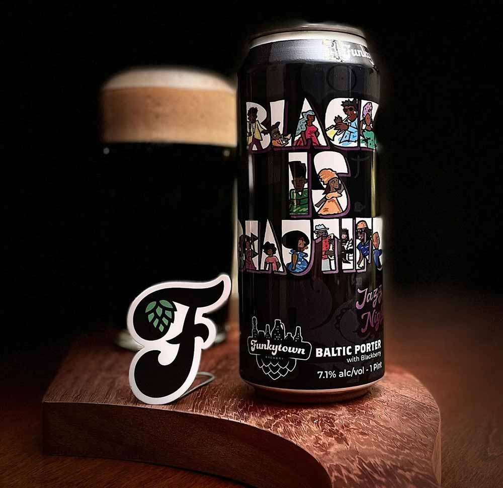
Black Is Beautifual – Jazz Nights
Funkytown Brewery — Chicago, IL
Submitted by: Grace Lee-Weitz, Senior Content Editor, Hop Culture
Art by Ahmad Lee (@recothegreat)
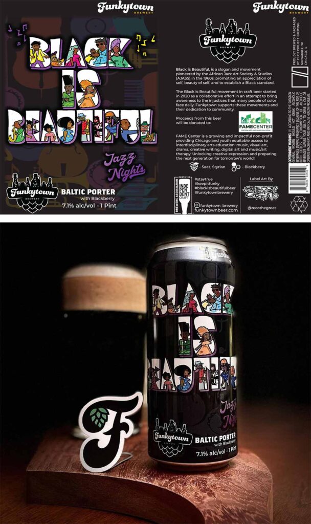
Label artwork courtesy of Ahmad Lee (@recothegreat) and bottom photo courtesy of Marjorie Wright (@wrightdeckbeers)
Did you know the phrase “Black is Beautiful” comes from a series of fashion shows from the 1960s? In beer, we all know those three little words thanks to former Weathered Souls Co-Founder Marcus Baskerville, who started the Black is Beautiful campaign after the murder of George Floyd in 2020 to raise awareness around racial injustice and police brutality.
But Funkytown’s iteration of this beer, released earlier this year and dubbed Black Is Beautiful – Jazz Nights, shows us that this phrase has an even more powerful foundation.
To combat systemic racism and restore racial pride in Harlem, two brothers—Kwame Brathwaite and Elombe Brath—founded the African Jazz Art Society and Studios (AJASS), producing a fashion show with one message: Black is Beautiful.
The show, called ‘Naturally 62’ in short, showcased models with darker skin and natural, tightly coiled hair wearing African-inspired clothing.
At the time, most models were white women, following Eurocentric beauty standards. This show turned things upside down, giving power back to Black women and spotlighting Black beauty on the center stage.
These Grandassa models, named after the term “Grandassaland,” aka Africa, “staunchly refused Euro-centric beauty standards and added empathetic context to the phrase Black is Beautiful,” wrote Funkytown Co-Founder Rich Bloomfield in an email to Hop Culture. “The Grandassa models were showcased in Africa, the Caribbean, and other destinations. These women became known worldwide, appearing in newspapers and magazines and on album covers. The impact affected Black culture around the world, highlighting the values of self-love, inner beauty, and connection to Africa.”
In March 2023, Funkytown connected with Cinque Brathwaite, son of the late Elombe Brath and his wife Helene Nomsa, one of the original Grandassa models, hearing his stories about the impact of that fashion show and the lasting legacy of those three words: Black is Beautiful.
Funkytown poured that inspiration into Black is Beautiful – Jazz Nights, an homage to the original founders of the phrase.
On the can, you’ll find an absolutely gorgeous label created by Ahmad Lee (@recothegreat) and inspired by the original Black is Beautiful poster, designed by Bob Gums and Kwame Brathwaite. Inside the actual letters, Bloomfield says you’ll find depictions of Jazz musicians.
Along with its artwork and mission, this beer carries on a revolutionary legacy.
Infrared AM’s
GOAL. Brewing — San Diego, CA
Submitted by: Dustin Jeffers, Director of Brewery Implementation, Next Glass
Brand and Art Direction by Jayson Pizarro (@jpizo) and Artwork and Design by: Mark Gamab (@markplstk)
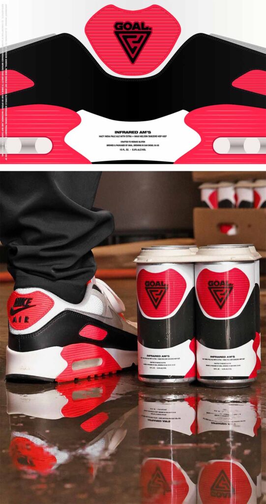
Label artwork courtesy of Mark Gamab (@markplstk) and brand and art direction courtesy of Jayson Pizarro (@jpizo)
As a sneakerhead and a beer enthusiast, I couldn’t resist adding this label to the list. GOAL. released Infrared AM’s to commemorate Nike’s Air Max Day this year. This label pays homage to the iconic shoe with its artwork and color scheme, making it instantly noticeable. And let’s not forget that GOAL. is also known for producing top-notch hazies in Southern California, so you know the liquid is just as good as the label.
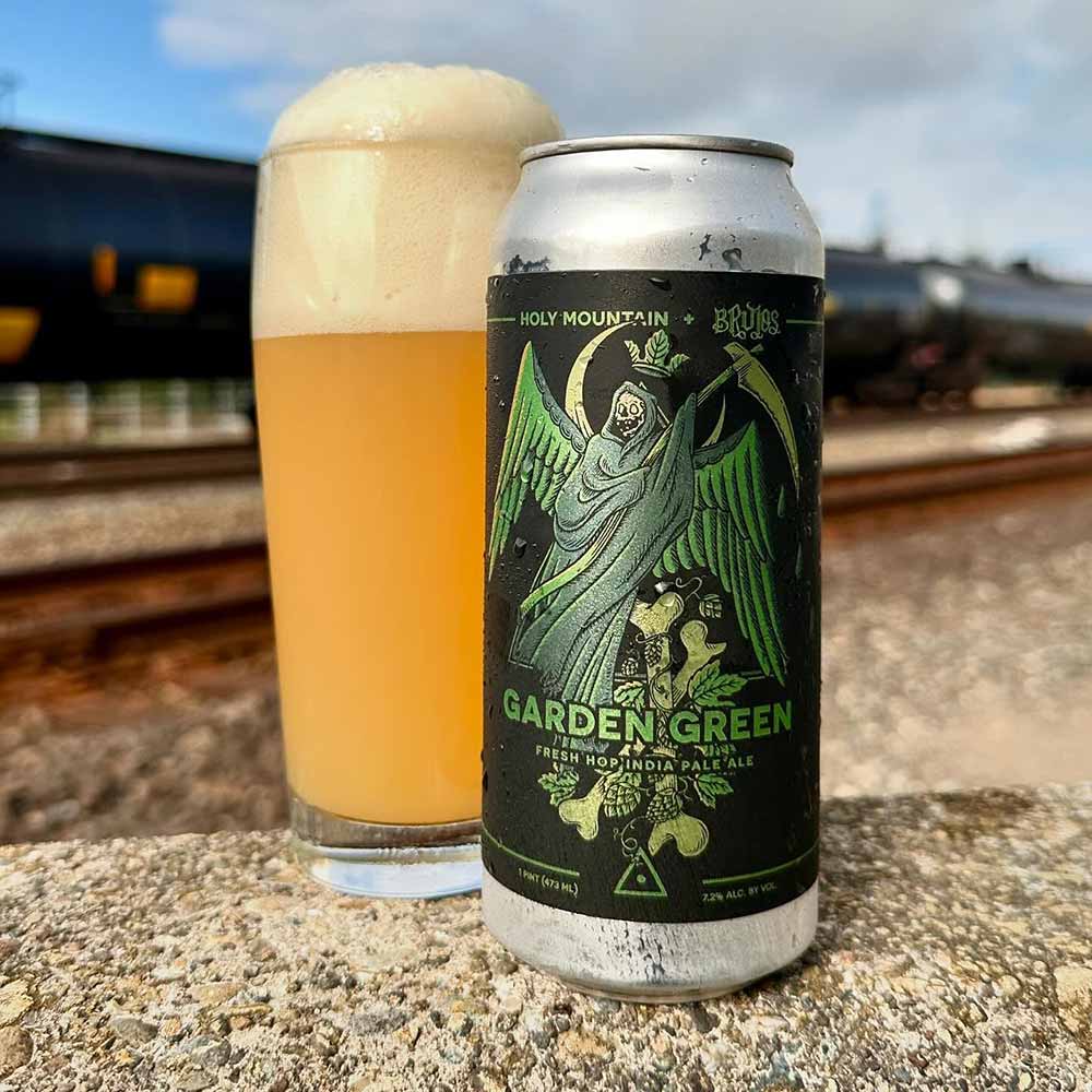
Garden Green – Fresh Hop IPA (2024)
Holy Mountain Brewing — Seattle, WA x Brujos Brewing — Portland, OR
Submitted by: Magic Muncie, Social Media Manager, Hop Culture and Untappd
Art by Ryan Williams – Holy Mountain Artist and Graphic Designer
Holy Mountain and Brujos are renowned for their striking metal artwork. Garden Green brilliantly combines their unique styles, and the exceptional beer within deserves recognition, too!
Holy Mountain Founder and Head Brewer Colin Lenfesty said the name came from the band REZN’s song “Garden Green.”
“We’re huge fans of REZN, and the name Garden Green seemed like a perfect fit for a fresh-hop collab with PDX-based Brujos,” Williams told us as he described his inspiration behind the label. “Bones, a cloaked reaper, a bunch of hops, and a not-so-discrete allusion to weed also just kind of fell into place as a meeting point between our two brands. Some of my favorite labels come together when the only guidelines are: What about something with the greens from the eyeballs on High On Fire’s Electric Messiah!”
Bummer Sauce
Batch Craft Beer & Kolaches — Austin, TX
Submitted by: John Gross, Director, Strategic Business Development, Next Glass
Art by Same Team Creative (@Chomp_all)
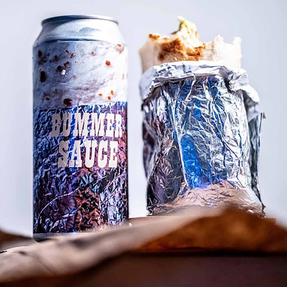
Label artwork courtesy of @Chomp_all
For the past year, I’ve been hoping I’d be asked my favorite can art of 2024.
I have an answer. You know, the one—that can that looked like a giant burrito.
Batch Brewing has an outstanding food truck on-site called Bummer Burrito with a smattering of propitiatory menu callouts such as Shrettuce™, Trashbrowns™, and, of course, Bummer Sauce™.
Holding that smooth, cold aluminum can, you can practically feel the heat of the flakey flour tortilla and sharp foil edges.
The beer itself has a perfect blend of domestic Pils, Vienna, and Munich malts with a cheeky sprinkling of both corn and rice to build out the body. JUST LIKE A BURRITO! The recipe is topped off with a light dose of old-timey German hops, and a Czech lager yeast lassos the whole shooting match together.
On & On: Part 3
Revolution Brewing x Half Acre Beer Co. — Chicago, IL
Submitted by: Derek Campos, Senior Graphic Designer, Next Glass
Art by Matt Gordon (@mattgordon_paintings)
Artwork courtesy of Matt Gordon (@mattgordon_paintings)
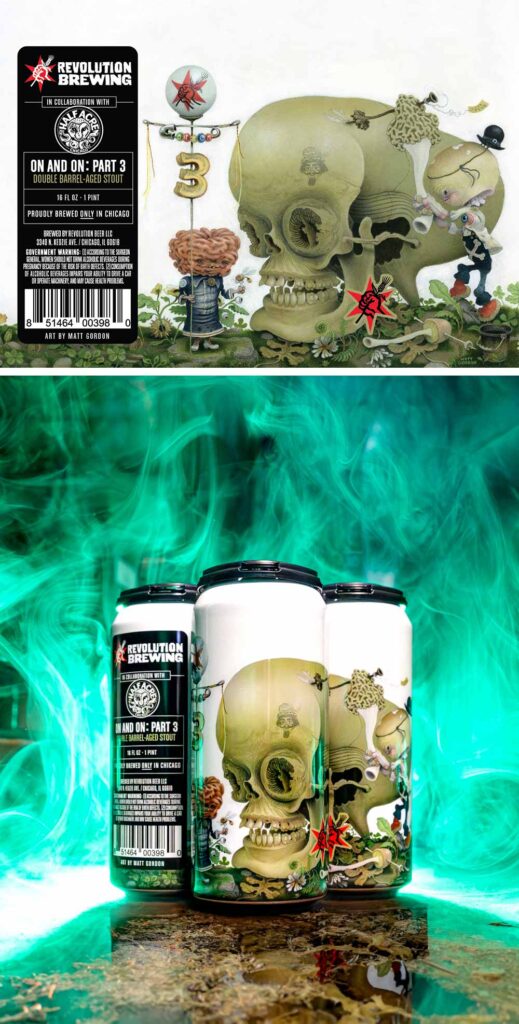
While drinking On & On: Part 3, you can stare at the can for an hour, which is probably how long it should take you to finish it with its high ABV. This can really celebrates the label’s artwork, which is loaded with intricate detail and mind-bending visuals that make up this surrealist-inspired art by Matt Gordon.
Revolution initially commissioned Gordon, who doesn’t create digital artwork, in January 2021 for a two-part collaboration with Half Acre. Known for his “intensely naturalistic and exceptionally detailed” compositions, Gordon adds his sketches to the canvas one element at a time.
The approach creates almost otherworldly graphics that seem to fit this beer perfectly. “Matt’s scenes move and breathe in line and brushwork and evolve during painting,” wrote Revolution. “If he needs something to move over a little bit, he paints over it and recreates it … ’I want to put beauty into the world,’ he told us. ’This is my kind of beauty.’”
Floral Dome, Desert Dome, and Tropical Dome
Component Brewing — Milwaukee, WI
Submitted by: Grace Lee-Weitz, Senior Content Editor, Hop Culture
Art by Rachel Bertsch
Label artwork courtesy of Rachel Bertsch
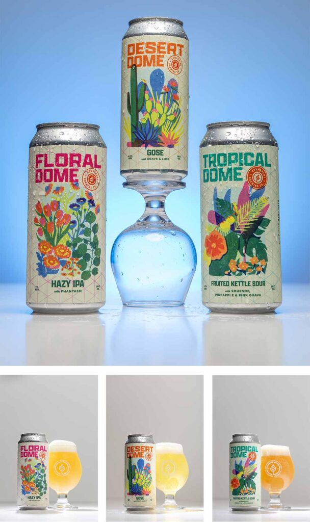
Created as an homage to a horticultural conservatory in Milwaukee called “The Domes,” these three beers—Floral Dome, Desert Dome, and Tropical Dome—come together in a bouquet of elegant artwork.
Designed by Rachel Bertsch, the labels from these three beers come alive, bursting with floral shapes and pops of color.
According to Component Brewing Co-founder Jonathan Kowalske, The Domes is an icon in the Milwaukee community that is in danger of closing. Component Brewing’s series beautifully represents this architectural landscape and seeks to raise awareness and funds to help The Domes survive.
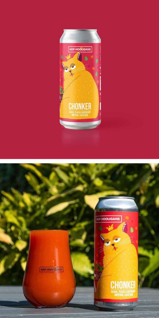
Chonker
Hop Hooligans — Jilava, Romania
Submitted by: Magic Muncie, Social Media Manager, Hop Culture and Untappd
Art by Diana Barbu (@dianabarbu.illustration)
Hop Hooligans goes beyond crafting exceptional beers; they weave delightful and whimsical tales on every can. Chonker exemplifies their lively character and fantastic energy.
West Coast IPA Is Dead
Green Cheek Brewing Company — Orange, CA
Submitted by: Dustin Jeffers, Director of Brewery Implementation, Next Glass
Art by Green Cheek Brand Director Patrick Carrie (@patrickisrad)
Label artwork courtesy of Patrick Carrie (@patrickisrad)
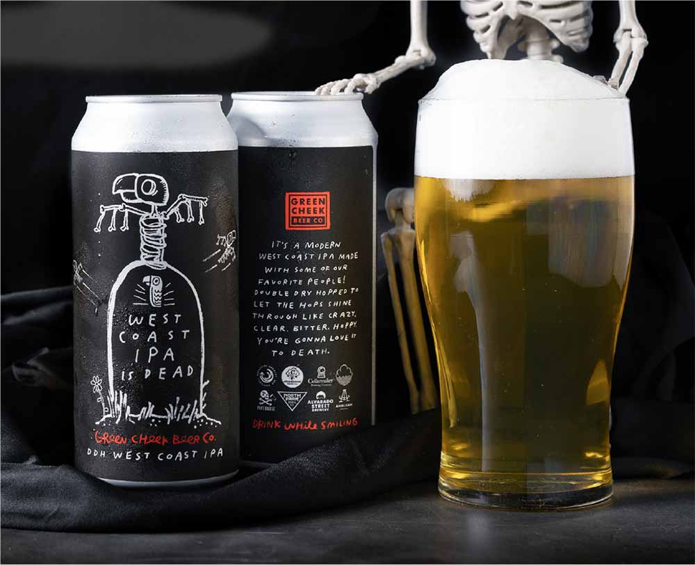
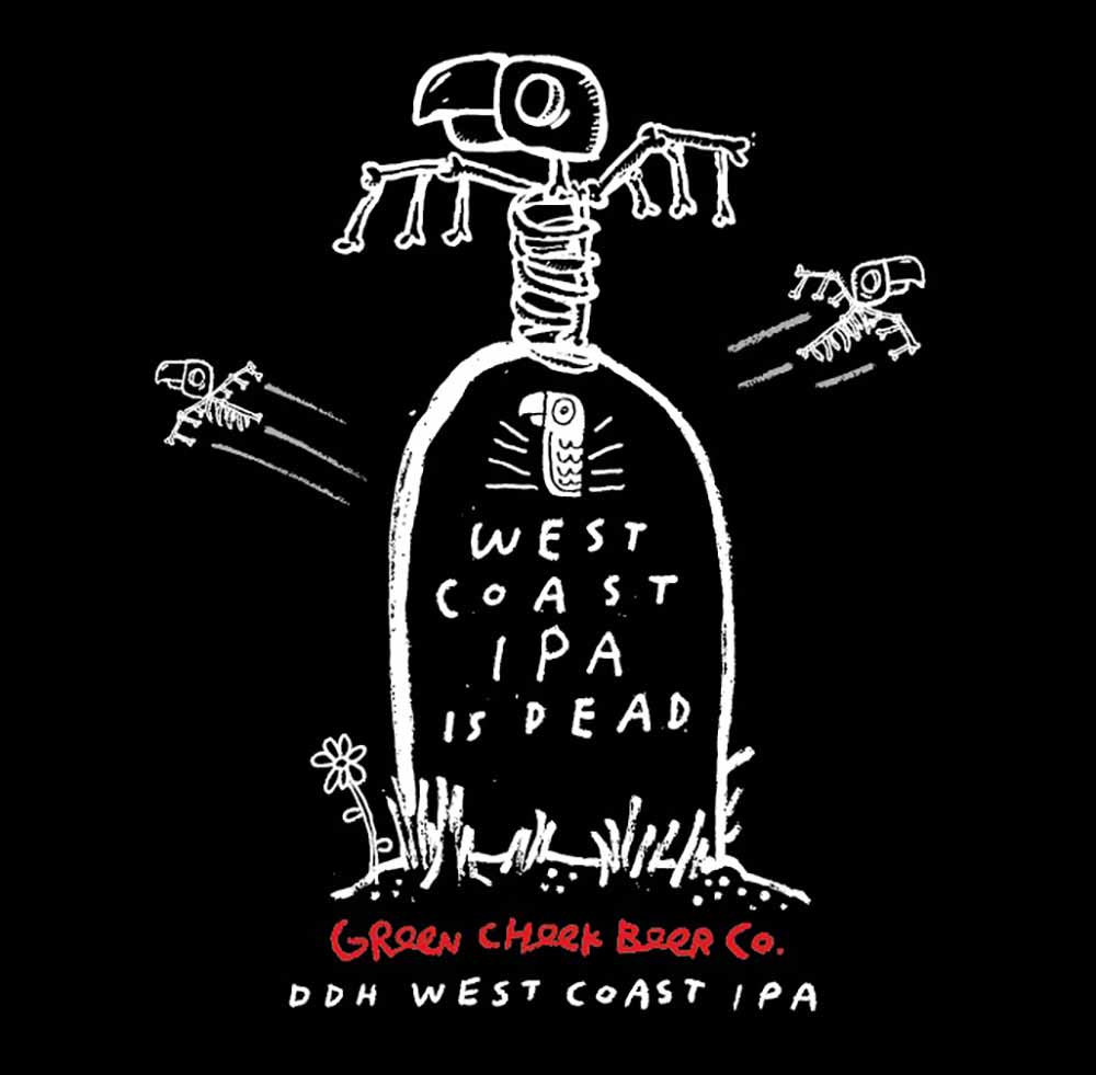
This label for West Coast IPA Is Dead, though not particularly flashy with vibrant colors or metallic finishes, consistently catches my attention. I noticed it scrolling through Instagram and was drawn to it again at a bottle share last month. The striking white drawing on the black label, complemented by a vibrant red pop, is an eye-catching design. This collaborative West Coast IPA, brewed by a team of esteemed breweries, including Alvarado Street, Amalgam, Breakside, Cellarmaker, Cloudburst, Cloudwater, Pinthouse, and North Park, is a welcome reminder that the West Coast (IPA) is back.
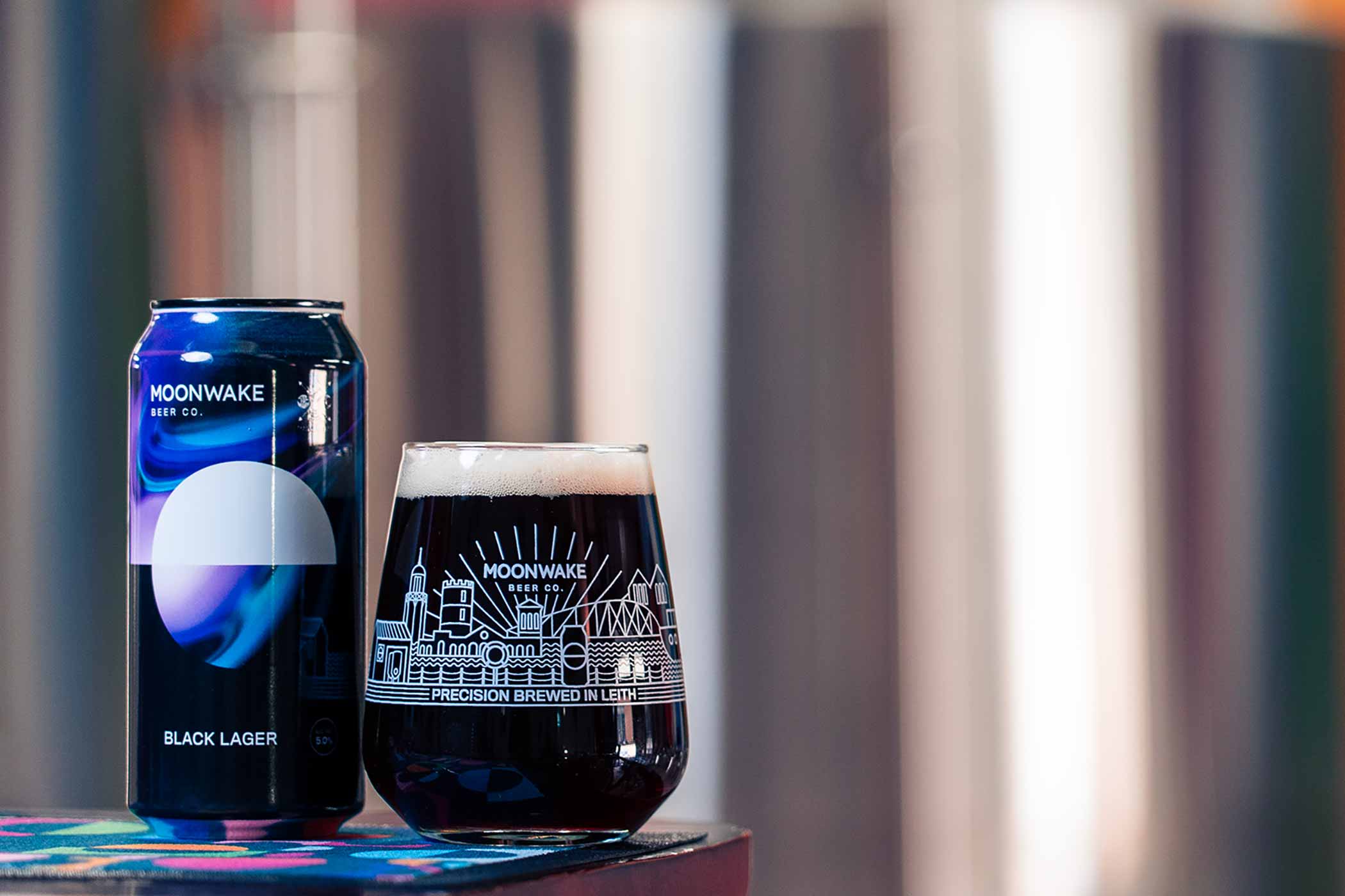
Black Lager
Moonwake — Edinburgh, Scotland
Submitted by: Grace Lee-Weitz, Senior Content Editor, Hop Culture
Art by Greig Pirrie
Half circles of navy inset in forest green and sunflower gold. Geometric shapes in bright red bounce off white half-moons dipped in baby blue. In front of the striking mural, which spans the length of one wall of the brewery, a thirty-five-hectoliter brew kit sparkles like Vega and Sirius, two of the brightest stars in the galaxy.
At the helm is a bushy-bearded man in tan boots and red and black cargo pants bent over cleaning the deck with a brush. With a navy knit beanie pulled down low and a long gray sleeve with thumb loops, he looks almost like he’d be as at home on a ship deck as he is on a brew deck.
Moonwake Beer Co. Co-founder Vinny Rosario captains the three-year-old brewery at the Shore in Leith, Edinburgh.
Down a craggy cobblestone street right off the docks, the taproom sticks out. Turn the corner, and you’re hit with a fuschia door surrounded by blue, green, red, and yellow geometric shapes. Walk up the stairs or take the accessible lift up to the mezzanine taproom, and the vibrant mural immediately strikes you, a cacophony of color blazing against the shining steel.
Named after the moon’s reflection on a body of water, Moonwake Beer Co. embodies these shimmering layers. You can never quite pin them down, yet you are surprisingly impressed by their beauty.
As much as Rosario will tell you, Moonwake Beer Co. is old-school and straightforward, but the beers he’s making and, most notably, the environment he’s creating are about anything but.
Inside those dappled walls, I found Black Lager.
“I love black lagers,” Rosario tells me. “I’m mainly a lager drinker, to be fair.”
He explains that they brewed the beer in collaboration with Tartarus Beers during Collabageddon 2023, a national competition where twelve random breweries collaborate to make beers.
Known for its imperial styles, Tartarus and Moonwake felt a black lager encapsulated both breweries perfectly.
Rosario explained that the beer starts with a base of lager malt, wheat, a little Vienna, Carafa III for color, and a tiny bit of roasted barley.
So it makes sense that I mostly find coffee and roast as I sip on the dark lager. But then, a lovely fruitiness pokes through.
Rosario’s lips twitch up toward a slight grin. In addition to Solero hops, Moonwake dosed its Black Lager with a last-minute addition of Nelson.
For me, it changed my initial sense of Black Lager from something more like a thick, rich Ethiopian coffee to a slightly fruity Guatemalan one.
You can see that shine through in the artwork, which shows a simple white half circle above the event horizon, dipping into complex, mesmerizing black and blue swirls below.
I can see why Rosario considers this one of his favorites. It’s one of mine now, too.
Edelweiss Pilsner #58 – Chevallier Helles (Summer 2024)
Hanabi Lager — Napa, CA
Submitted by: Magic Muncie, Social Media Manager, Hop Culture and Untappd
Art by: Michael Kortis, Heroist
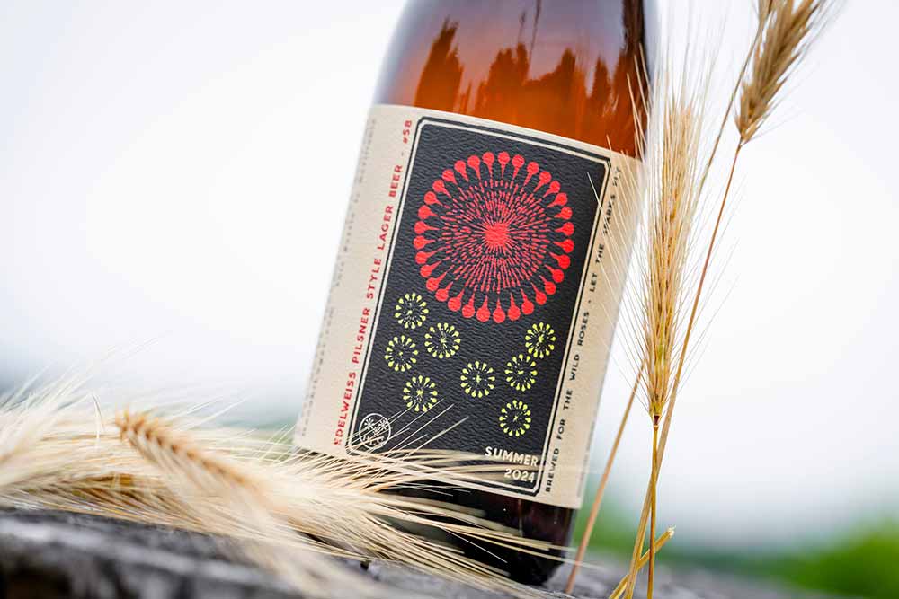
Photography courtesy of Susanne Becker Bronk (@bronkphotography)
Hanabi’s fireworks-inspired labels are stunning works of art. All the designs originate from old Japanese fireworks catalogs. According to Hanabi Lager Owner Nick Gislason, they work with Michael Kortis of Heroist to hone in on the final label designs. “He’s a rockstar,” wrote Gislason in an email to Hop Culture.
As Gislason explained to us, all of Hanabi’s labels are intended to resonate with the seasons. “In the exact same way that we design our actual fireworks, like music, to draw out different emotions from people, the beer labels are intended to make you feel the season that the beers are focused on: Winter, Spring, Summer, Autumn,” wrote Gislason. “Broadly speaking we love to help people feel the optimism and rebirth of Spring, the expansiveness and productivity of Summer, the nostalgia of Autumn, and the dreamy and preparatory nature of Winter with the fireworks that we choose for those series of beer labels respectively.”
The latest addition, Edelweiss Pilsner #58, perfectly captures their essence and is only rivaled by the phenomenal beer inside.
“The same goes with the grains we choose for each seasonal beer: We are working to create a resonance between the flavors of the beer, the look and feel of the label, and the pure spiritual essence of each season,” wrote Gislason. “It’s one of our greatest pleasures to fully embrace the spirit and beauty of each changing season, and the state of mind that it puts us in.”
We’d say: Mission accomplished.

