Shop
The 16 Most Insane Beer Labels from North Carolina Breweries
16 beers labels. One winner. Bracketology at its best.
Last month, madness descended on North Carolina. And no, we’re not talking about the University of North Carolina Tar Heels men’s basketball team ruining Coach Mike Krzyzewski’s final season by defeating the Duke Devils in the Final Four of the NCAA Tournament. While that March Madness certainly had us in a frenzy, so too did the North Carolina Craft Brewers Guild’s 2022 Label Insanity Competition presented by Oznr, SeaThirst Creative, and Express Labels. The annual tournament searches for the best beer labels by pitting local North Carolina breweries against each other–bracketology-style.
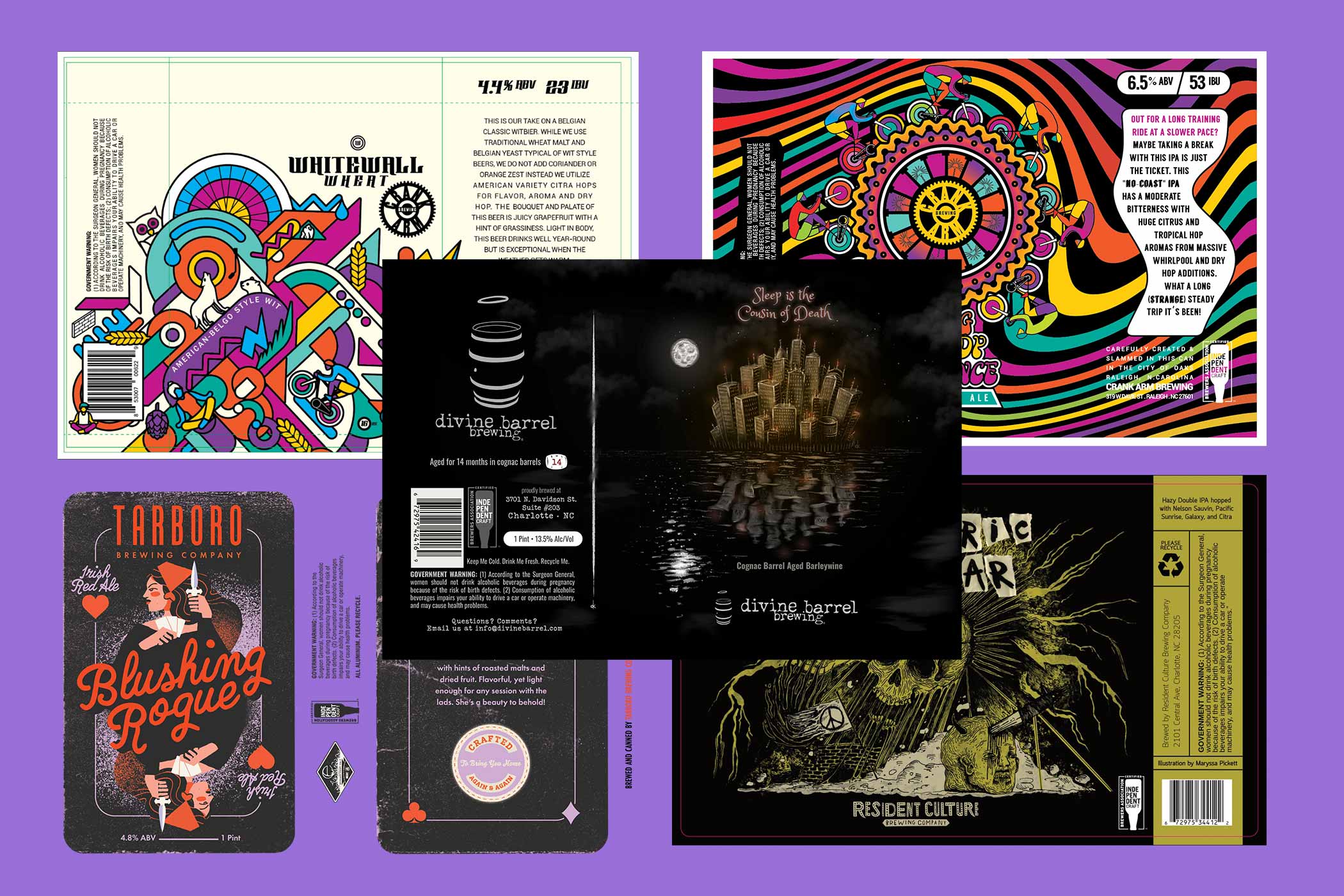
This year’s crop, from the who’s who of North Carolina breweries, such as Resident Culture, Divine Barrel, Crank Arm, and more, showcases the humorous, whimsical, insane, and sometimes introspective power of can label designs.
What Is the Label Insanity Label Art Competition?
Photography courtesy of North Carolina Craft Brewers Guild
The two-part competition began with a panel of judges, evaluating 260 entries from over fifty North Carolina breweries in sixteen different beer style categories. Judges selected their favorite first-, second-, and third-place winners based on the following criteria:
Visual Interest – Did the design effectively capture interest and engage?
Creativity – Did the design show innovation and originality?
Craftsmanship – Was the design technically well executed?
Overall Impression – Was the overall design composition clear and appealing?
Now, the Guild is handing the voting reigns over to the people!
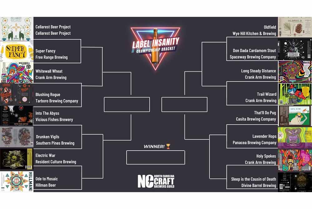
Each first-place winner from the sixteen different beer style categories has been entered into the People’s Choice Label Insanity Bracket Tournament in a head-to-head single elimination that will play out in rounds until a final winner is chosen. You can cast your vote daily for your favorite.
How can you participate? It’s easy. To cast your vote, just head over to @ncbrewersguild on Instagram and vote daily in their IG Stories to help your favorite designs win. Or check out everything you need to know here.
We’re huge fans of celebrating both art and beer, rounding up our favorite can label designs since the magazine’s very first year in 2017 and every year thereafter.
Most recently, our “25 Best Beer Labels of 2021” was one of our top-performing pieces. So it seems like you all enjoy the innovative, evocative designs on your cans too!
To help celebrate this year’s Label Insanity, we’re taking a look at the Sweet Sixteen First-Place Finalists and telling you why we love them so much.
From there, it’s up to you to decide which is your favorite. Read on and cast your vote!
NC Craft Brewers Guild’s Top 16 Most Insane Beer Labels of 2022
Light Lagers & Blonde Ales
Winner: Cellarest Beer Project
Cellarest Beer Project – Asheville, NC
Label courtesy of Cellarest Beer Project
Art By: @wadeasa
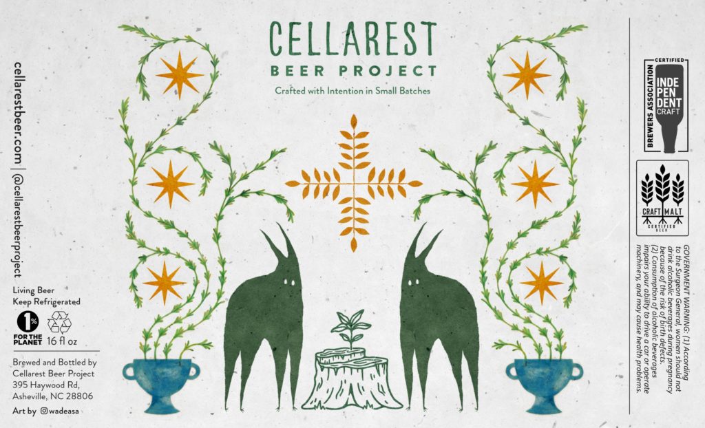
Wade Asa describes his work as “existing in the subterranean spaces between memory, dreams, and imagination.” This perhaps perfectly describes the artwork for Cellarest Beer Project’s label.
Whimsical creatures stand amidst environmental elements like a tree trunk and perhaps hop bines sprouting from chalices. It’s a fitting design for the brewery.
Cellarest Beer Project, a farmhouse-inspired ale and lager brewery, ferments beer in wooden barrels to capture the complex and innovative flavors of nature. Looking at this label makes us feel like we’ve opened the wardrobe door and walked to the back of the closet into Narnia. (Or for a deep cut…the grandfather clock and entered into Fillory).
Malty, Amber, & Dark Lagers
Winner: Super Fancy Malt Liquor
Free Range Brewing – Charlotte, NC
Label courtesy of Free Range Brewing
Art By: Free Range In-House Design Team
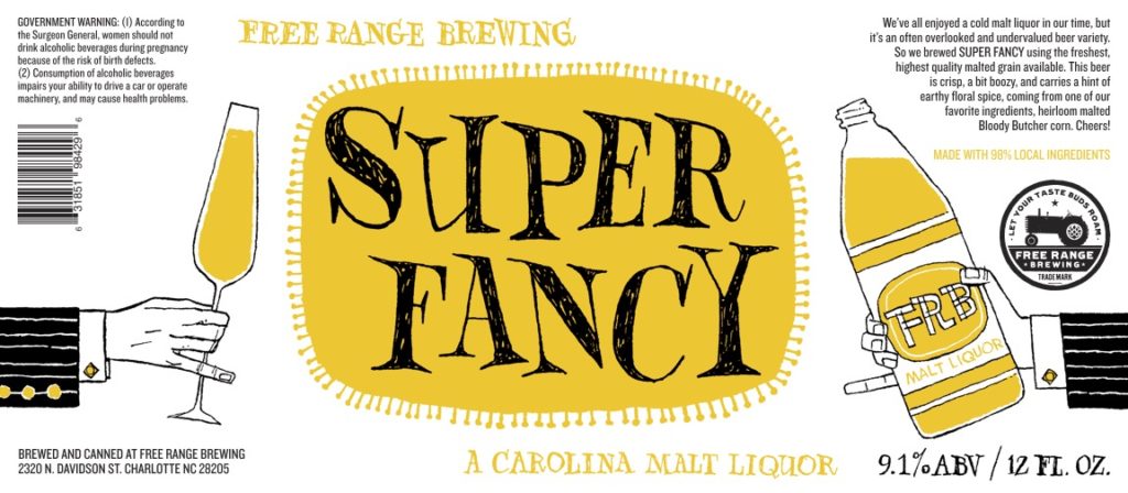
What we love about this label from Free Range is the playful juxtaposition between fancy and formal and dirty and down to earth.
As it says on the label, “We’ve all enjoyed a cold malt liquor in our time.” We know we’ve certainly imbibed a Colt 45 or two (sometimes with one duct taped to each of our hands), but Free Range executed the perfect craft version. With this design, we’re picking up on some of those 1950s and ‘60s Mad Men / I Dream of Jeannie vibes. It’s a little kitschy, a little whimsical, and a lot of fun.
Wheat Beers
Winner: Whitewall Wheat
Crank Arm Brewing Company – Raleigh, NC
Label courtesy of Crank Arm Brewing Company
Art By: @saturdaysgravy
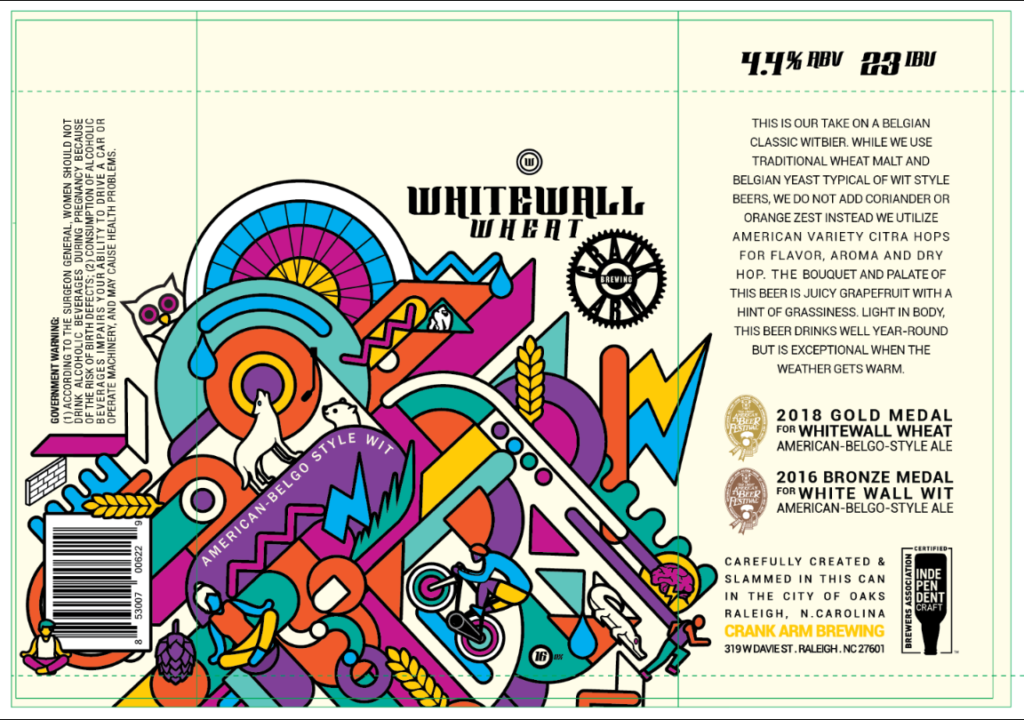
Bright pops of color and sharp shapes catch our eyes first with @saturdaysgravy’s design for Crank Arm’s Whitewall Wheat. But take a closer look behind the kaleidoscope-like artwork and you’ll pick out important elements.
For instance, a bicycler, a runner, and a person doing yoga. All nods to Crank Arm’s focus on cultivating an active lifestyle. You’ll also find beer elements such as a hop cone and a wheat stalk. All seem to playfully speak to the 2018 Gold Medal Award-Winning American-Belgo-Style Ale from the Raleigh-based brewery devoted to sports and the outdoors.
Amber & Red Ales
Winner: Blushing Rogue
Tarboro Brewing – Tarboro, NC
Label courtesy of Tarboro Brewing
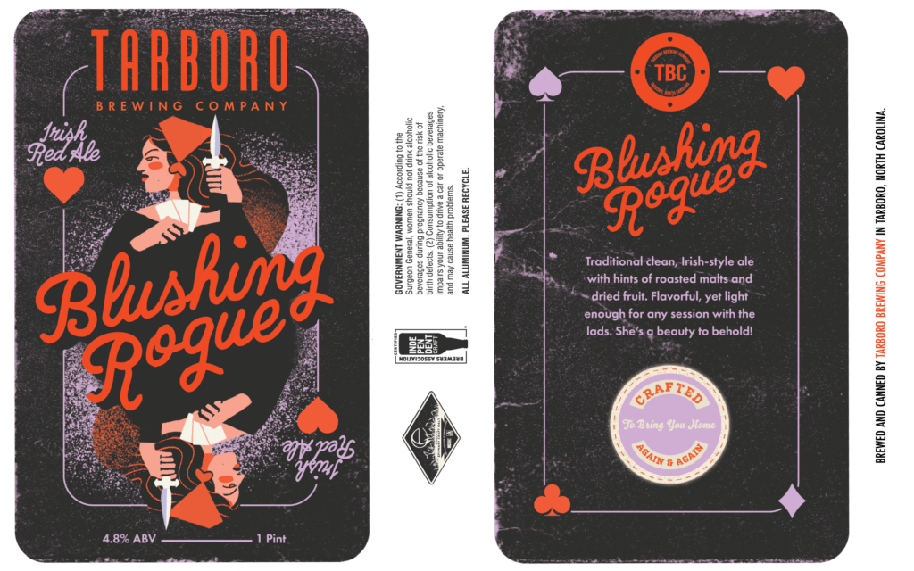
Actually, this one really perplexes us. Cue us…blushing a bit.
Described as a “traditional clean, Irish-style ale with hints of roasted malts and dried fruit,” Blushing Rogue on the label seems to be playing with a card or poker theme.
Regardless, it’s an intriguing take on redesigning what a traditional queen card in a deck might look like. Looks like a straight flush to us.
Porters & Brown Ales
Winner: Into The Abyss
Vicious Fishes Brewery – Apex, NC
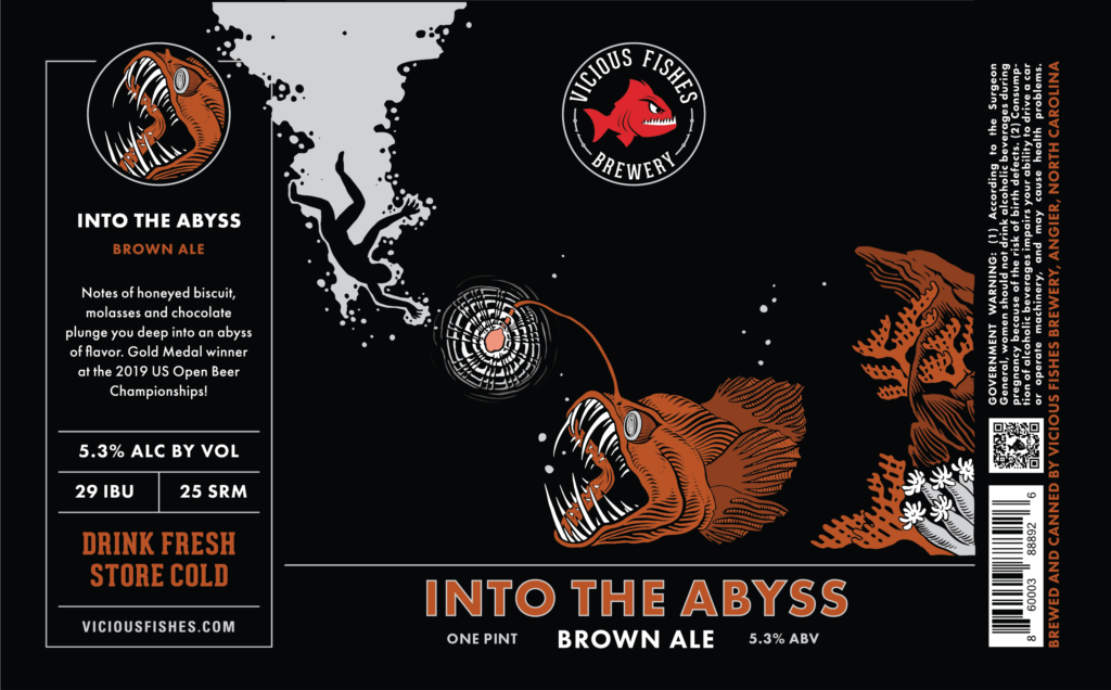
Label courtesy of Vicious Fishes Brewing Company
Art By: Sam Parker & Jacob Voigt
What’s in the abyss? Defined by Oxford Languages as “a deep or seemingly bottomless chasm,” the word abyss can conjure up a number of images.
Here, Sam Parker and Jacob Voigt capture Vicious Fishes’ own imaginative take with a body falling deep into the ocean. Waiting at the very end? It’s a black seadevil or female anglerfish. You may be familiar with this creature from Finding Nemo, a fish with crazy-looking teeth and an illuminated rod hanging from its head.
Yeah, this label scared us for sure!
But regardless, we still wanted to tumble into this deep, dark brown ale with notes of honeyed biscuit, molasses, and chocolate. A Gold Medal winner in the 2019 U.S. Open Beer Championship, Into The Abyss can now add First Place in the 2022 Label Insanity Competition in the Porters & Brown Ales category to its trophy case.
A beer this good needed a label to match, and boy did Vicious Fishes deliver.
Stouts & Imperial Stouts
Winner: Drunken Vigils
Southern Pines Brewing Company – Southern Pines, NC
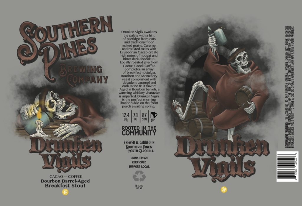
Label courtesy of Southern Pines Brewing Company
Art By: Craig Morrison
Artist Craig Morrison injected a bit of humor into Southern Pines Drunken Vigils label. The Bourbon Barrel-Aged Breakfast Stout with a hint of porridge from oats and traditional floor malted grains adds Ecuadorian Cacao and locally roasted Cactus Creek Coffee for a complete breakfast in a cup.
If monks often drank beer as their liquid morning bread, we can imagine drinking Drunken Vigils for the perfect AM meal.
Now, whether this beer wakes you up—like its dancing skeleton on the right—or puts you to sleep—like the slumbering one on the left…that’s probably up to you and how many cans of this you drink.
Strong Ales & Imperial (Double/Triple) IPAs
Winner: Electric War
Resident Culture Brewing Company – Charlotte, NC
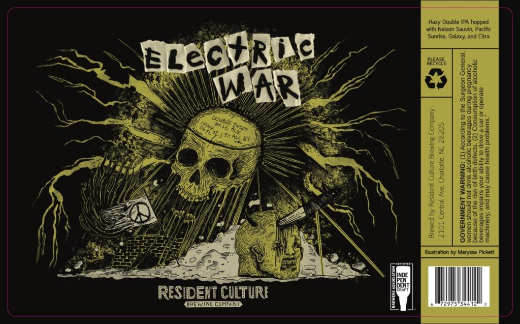
Label courtesy of Resident Culture Brewing Company
Art By: Maryssa Pickett
We’ve been closely following Maryssa Pickett’s work at Resident Culture for the last couple years. In fact, in 2020, we named her design for the brewery’s Out to Pasture one of our favorite of the year. Her art is unmistakable and has catapulted Resident Culture to the top of some of the most prolific designs in the beer industry.
Electric War doesn’t disappoint, charging us with currents of death, destruction, and debris. By just taking one look at the artwork, we can imagine that this hazy double IPA hopped with Nelson Sauvin, Pacific Sunrise, Galaxy, and Citra will destroy our palette with juiciness and electrify our taste buds.
And afterall, that’s the power of a good can label, right? From a single work of art, it reveals a bit of what’s inside, enticing you to take one sip.
Session IPAs
Winner: Ode To Mosaic
Hillman Beer – Old Fort and Asheville, NC
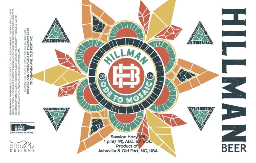
Label courtesy of Hillman Beer
Art By: Meagan Maurer
At first glance, this label appears simple. But look a little bit closer and you’ll notice the complexity of the shapes, lines, and colors. It’s a mosaic tile made to represent the perfect Mosaic beer.
More than that, we feel this label perfectly represents the style. After all, session IPAs at first glance appear to be simple beers, but delve deeper into their layers and you’ll find complex creations packaged up in highly quaffable cans.
Pale Ales
Winner: Oldfield
Wye Hill Kitchen & Brewing – Raleigh, NC
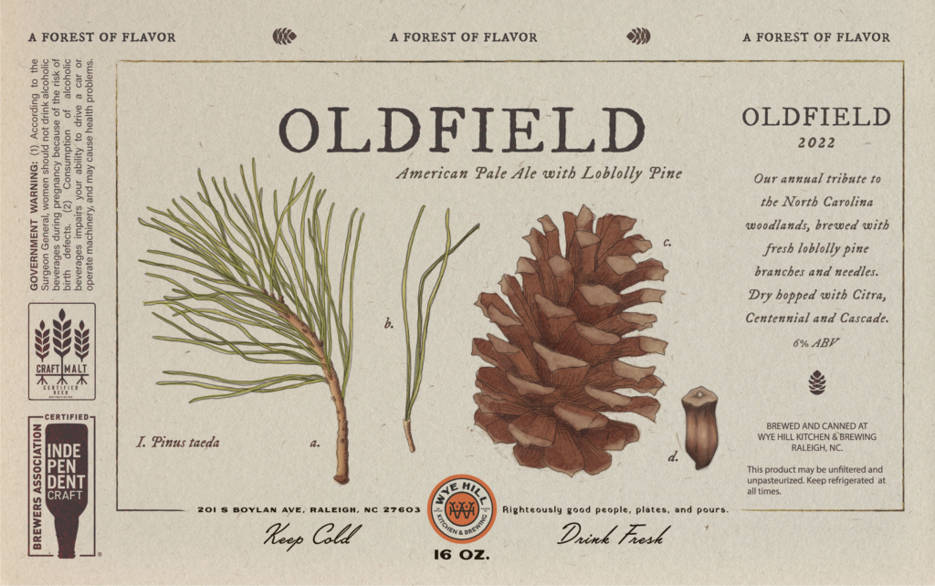
Label courtesy of Wye Hill Kitchen & Brewing
Art By: Sadie Tynch
Taking one look at this design produced one word in our minds: forest. The delicately illustrated pinecone, branches, and needles eloquently depicts what Oldfield brewed here. An annual tribute to the North Carolina woodlands, Oldfield is a beer made with Loblolly pine, branches, and needles, and dry hopped with Citra, Centennial, and Cascade.
Artist Sadie Tynch managed to capture all those elements perfectly with just a few very distinctive images. I mean c’mon, the label itself almost looks like bark! It’s those little artistic touches that make a huge difference on this beer label.
IPAs
Winner: Don Dada
Spaceway Brewing Co. – Rocky Mount, NC
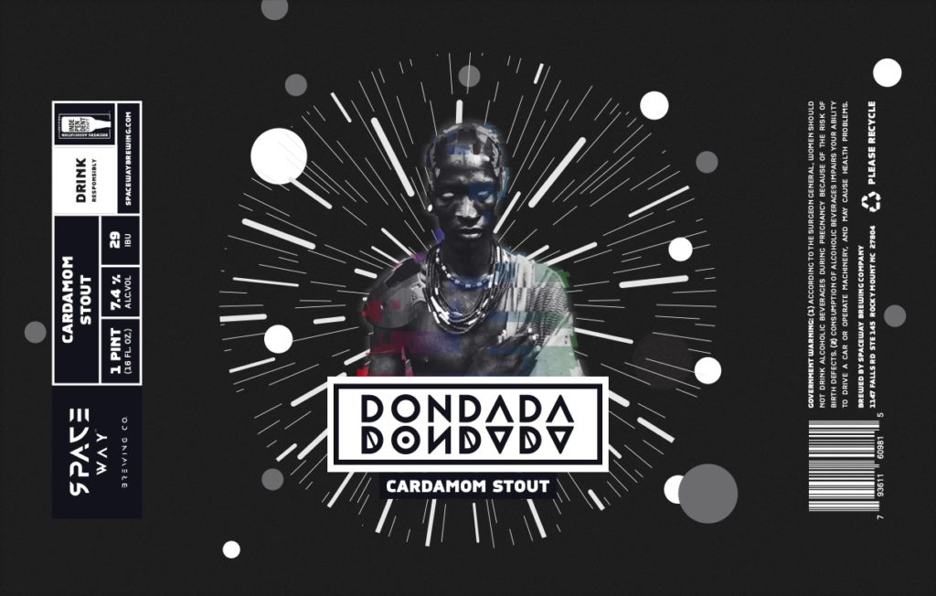
Label courtesy of Spaceway Brewing Co.
Art By: @two.studio
If Daft Punk made a beer…we imagine the label might look something like Don Dada.
Described by the Black-owned Spaceway Brewing as “an old fashioned in a beer. Slightly smoky bourbon flavor with a hint of cardamom and orange,” Don Dada is a super complex dark beer packaged in a fairly crisp, light package.
And it’s that play on light and dark that we love here. The strobe effect in the background gives us huge nods to Star Wars and galaxies far, far, away while the central figure strikes us with its ferocity and dabs of color.
Honestly, this label blew our minds.
Specialty IPA (black, rye, fruited, brut, etc….)
Winner: Long Steady Distance
Crank Arm Brewing Company – Raleigh, NC
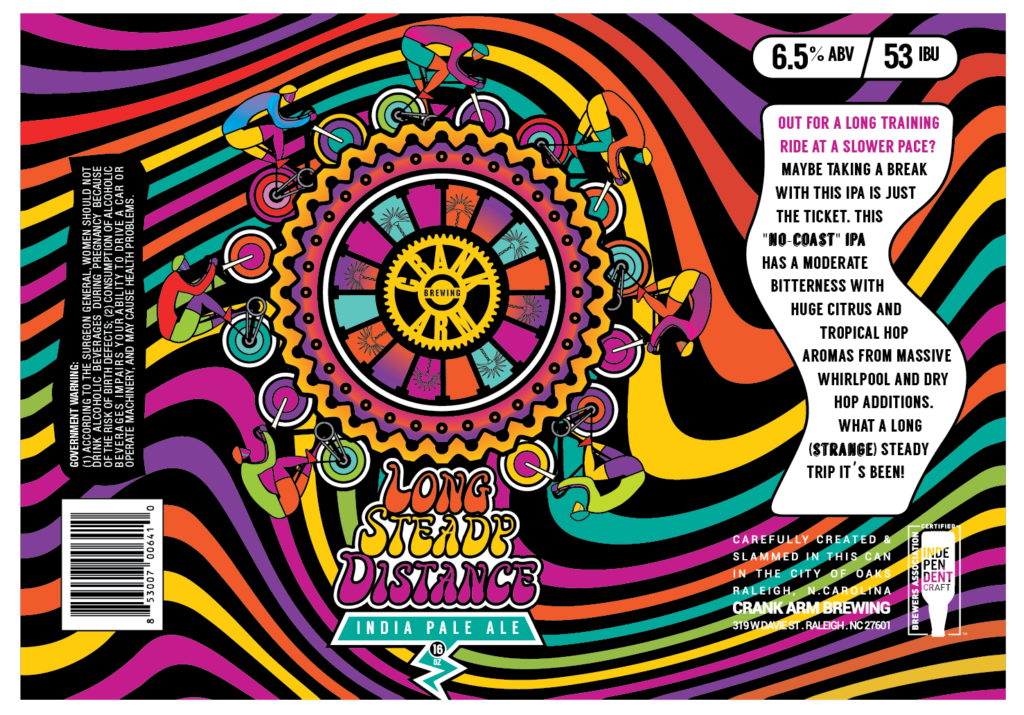
Label courtesy of Crank Arm Brewing Company
Art By: @saturdaysgravy
There is a very good reason why @saturdaysgravy’s designs keep appearing on this list—they’re colorful, whimsical, fun, and so on brand for Crank Arm.
With Long Steady Distance, the design company focused on groovy waves of color in the background while at the center a bicycle gear serves as the riding platform for a slew of bicyclists. It’s a never-ending riding circle for this “No Coast” IPA.
“What a long (strange) steady trip it’s been!” writes Crank Arm on the beer label. And we certainly feel that’s the message with this artwork: It’s a long, steady, strange journey into the inner workings of Crank Arm’s imagination.
New England & Hazy IPAs
Winner: Trail Wizard
Crank Arm Brewing Company – Raleigh, NC
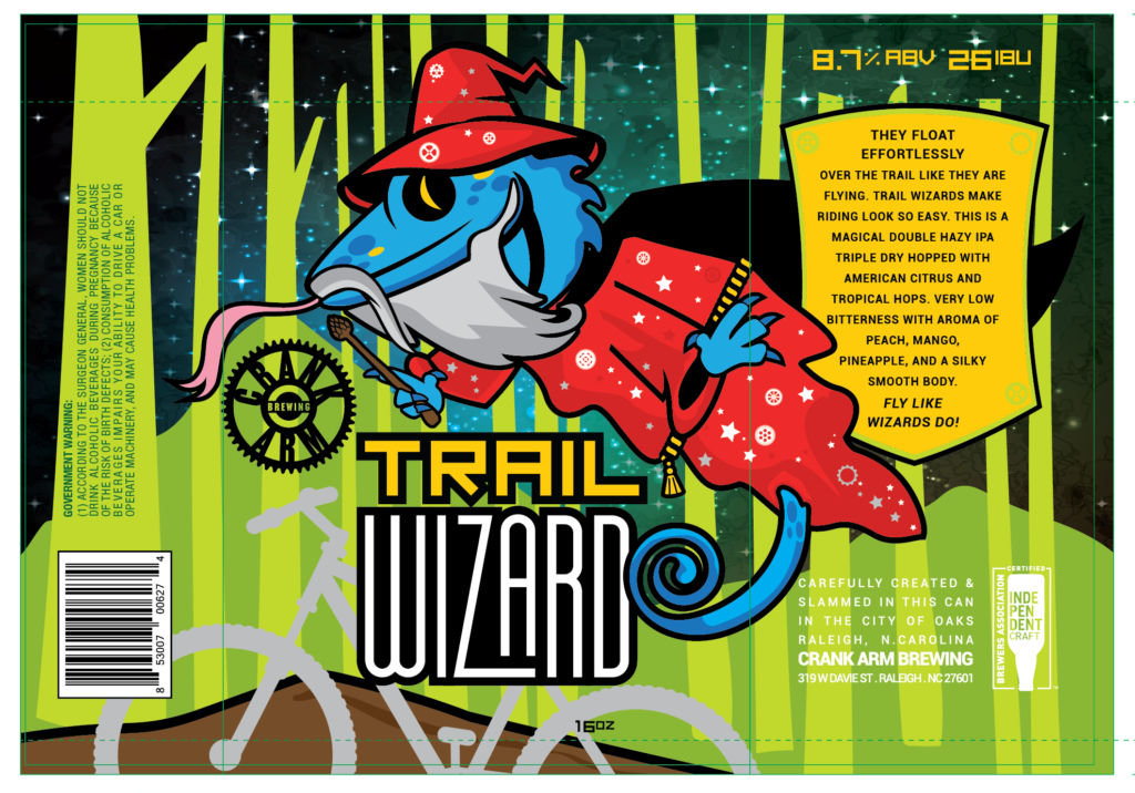
Label courtesy of Crank Arm Brewing Company
Art By: @saturdaysgravy
@saturdaysgravy strikes again with this striking design. As the design company writes on its Instagram page, “A floating wizard lizard in your special bevy full of hi-tech wizardry of hops, hills, and stargazing extravaganza: drain the magical double hazy IPA.” It’s certainly easy to get lost in the spell of Trail Wizard’s label.
Belgian & French Ales
Winner: That’ll Do Pug!
Casita Brewing Company – Wilson, NC
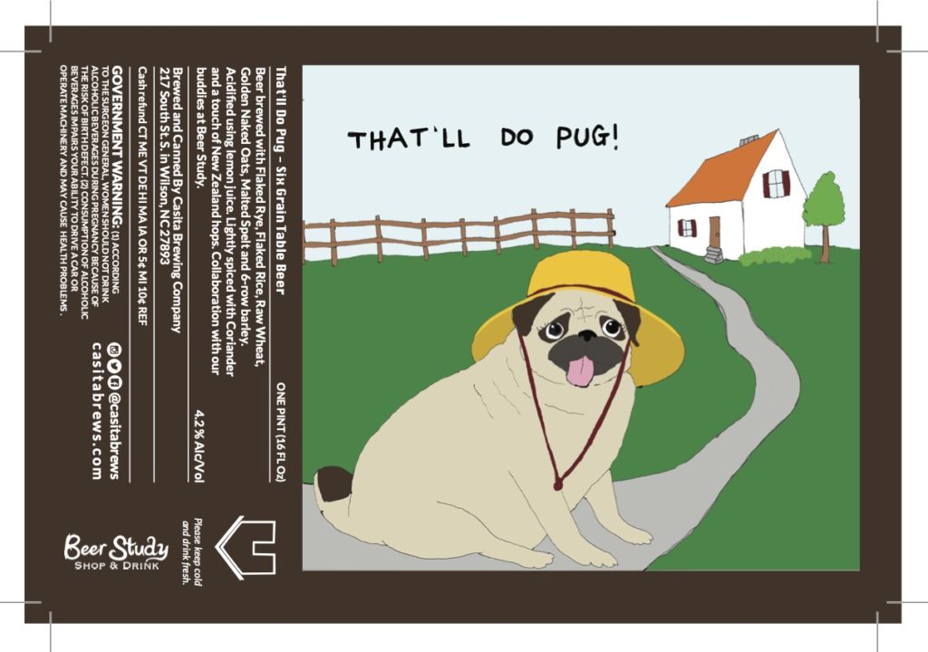
Label courtesy of Casita Brewing Company
Art By: @mahaliawittermerithew
This label is just straight up silly. And we mean that in the best way possible.
Cute pug ✅
Great name ✅
Nice animated movie reference ✅ (That’ll do donkey, that’ll do). Ten points for Gryffindor if you enjoyed our very mixed metaphor and just made that Shrek connection.
Cute pug wearing a silly hat ✅
Oh wait, did we say that already? This may be one of the simpler labels in the competition, but it’s also the one that makes us smile the most.
Sour, Brett, Mixed, & Wild Ales
Winner: Lavender Hops
Panacea Brewing Company – Wilmington, NC
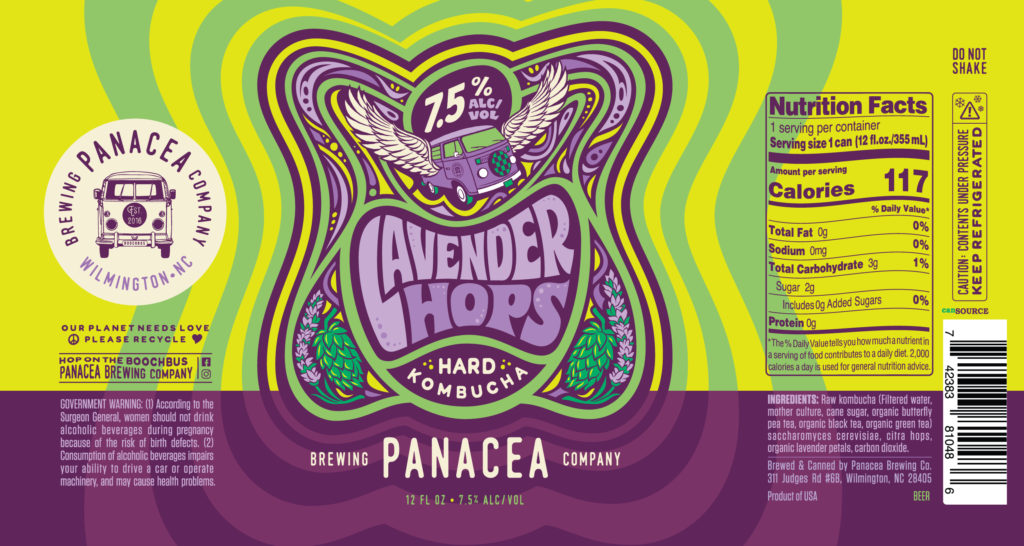
Label courtesy of Panacea Brewing Company
Art By: @creaturetheory
Hello, hard kombucha!
Well, if this label were a bumper sticker we’d slap it on Scooby Doo’s The Mystery Machine and drive off to solve the latest crime. Or we’d throw it in the window of our VW Camper and head over to the beach to shred the gnar. Oh heck, maybe we are just stuck inside a lava lamp. Hella cool, brah.
Either way, the Lavender Hops artwork created by @creaturetheory perfectly emulates Panacea’s groovy hard kombucha.
Cracking a can is like stepping back in time and doing the Hustle with our taste buds.
Spiced, Vegetable/Herb, & Seasonal Beers
Winner: Holy Spokes
Crank Arm Brewing Company – Raleigh, NC
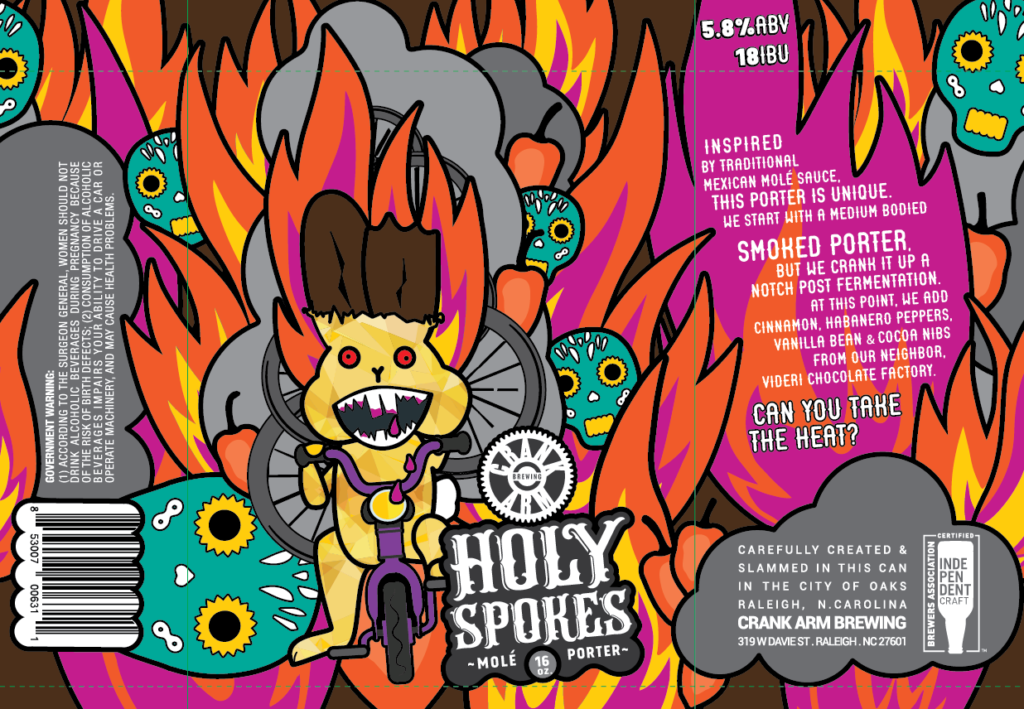
Label courtesy of Crank Arm Brewing Company
Art By: @saturdaysgravy
Crank Arm and @saturdaysgravy’s quadfecta of insane label awards finishes with Holy Spokes, a mole-inspired porter cranked up Crank Arm style.
Fashioned after a Mexican mole sauce, this porter includes cinnamon, habanero peppers, vanilla bean, and cocoa nibs from Videri Chocolate Factory. The label reflects the heat inside spouting incense flames and Mexican-inspired skulls. Similar to the ones you might find at Día de Los Muertos, a celebration of the dead Mexicans traditionally hold every year in early November.
Of course, with Crank Arm’s bicycle roots, the design firm doesn’t hesitate to include bicycles, gears, and spokes throughout the label.
Barrel-Aged (Wood) Beer
Winner: Sleep is the Cousin of Death
Divine Barrel Brewing Company – Charlotte, NC
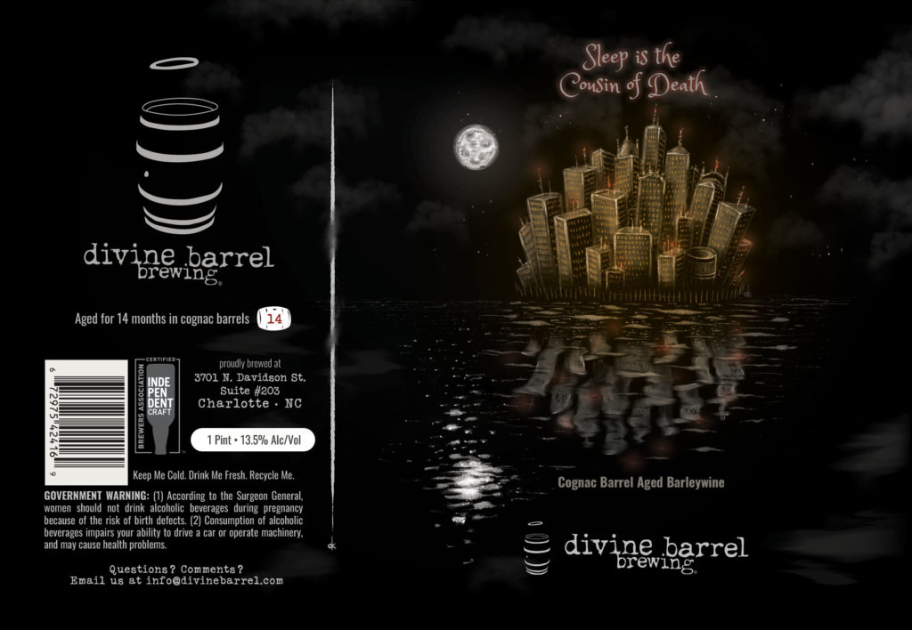
Label courtesy of Divine Barrel Brewing Company
Art By: Dave Kaminsky
Full disclosure, Dave Kaminsky’s artwork placed first in last year’s Label Insanity Competition in the “Pale Ale” category for his introspective take on Divine Barrel’s Sunshine Felt Like Rain.
Divine Barrel’s artist and designer has drunk and drawn his way around Charlotte, designing labels for Salud Cerveceria and Heist Brewery along with Divine Barrel. Kaminsky is known for his dry, playful wit balanced with nostalgia.
With Sleep is the Cousin of Death, Kaminsky blows us away again.
What we find so intriguing about Kaminsky’s labels are quite frankly trying to interpret his designs. They make us think and truly try to suss out the meaning of the beer.
Of course, drinking the beer while we turn inward to our thoughts certainly helps us peel back the layers on his designs.
Although with Divine Barrel’s cognac barrel-aged barleywine, this approach could go either way: Drinking the 13.5% ABV barleywine could put us to sleep, or maybe the extra alcohol will give us divine interpretation.
Either way, this label caused some serious meditation.
We see a glowing city across a deep, dark lake. Is this the River Styx, the mythological Greek river of the underworld we must cross? The word styx literally means shuddering and expresses loathing of death. So perhaps this label is a warning to all who attempt to drink the barleywine: Drinker beware—deep, dark depths lie within.
But, that’s just our take. What do you see in this label’s deep, dark depths?

