Shop
The 20 Best Brewery Websites of 2020
Surf the web with terrific beer.
Alright folks, strap in. You strapped? Good. Because we’re talking about brewery websites. Nay, we’re talking about the best brewery websites of the year.
You might not think about whether or not your favorite brewery’s website is functional, easy to navigate, or aesthetically pleasing–or if they even have a website at all–but as someone who writes about beer and often seeks information about specific beers or breweries, I’m visiting brewery websites on the daily.
Plus, in the year 2020, we realized the digital landscape can be critical to a business’ success.
So, does it matter if a craft brewery has a good website? Not necessarily. Websites cost money and take time. In the age of social media, anyone can share important information for free on Facebook, Instagram post, or through a Tweet. But, a quality website is a key differentiator. And honestly (and I should get this tattooed on my body because I say it so frequently), while good aesthetics in taprooms or on beer labels don’t necessarily mean a brewery makes good beer, it does suggest a certain level of thoughtfulness and care.
Beer is a wholistic experience. Your IPA might taste terrific, but if it looks like you don’t care about your can or taproom, I’ll likely visit another brewery. And I feel the same way about brewery websites.
What Makes a Good Brewery Website?
At its most basic, a good brewery website needs to have relevant info front and center. And it needs properly-sized photos, as well as an easily navigable homepage. And a responsive mobile site. These factors are the bare minimum. What are your hours if you have a taproom? What’s a good way to get in contact? Where is your brewery?
Now, all of these things make a good brewery website. But a great brewery website comes from a focus on good design, clean graphics, and simplicity.
Moreover, a great brewery website should feel authentic to the brewery. Now, in the grand scheme of things, a cute animation or a clever pun in your age verification landing page isn’t critical to the success of your brewery. We understand we’re diving into unnecessary waters. But, as someone who appreciates thoughtful design, a solid animation or stylish photo will catch my eye.
Investing in Good Design
As I mentioned before, there’s often a financial barrier to website design. But not always. While many breweries invest time and money into web design by hiring artists and developers to build a site — some of our favorite developers include studios like CraftPeak, Top Hat Designs, and Stout Collective — our favorite website of the year actually took a different tact.
Below are twenty of our favorite brewery websites ranging from the “so shitty it’s high-brow” to the “so complex it’s beautiful.” They’re presented in no particular order except for Floodland Brewing, which has earned our nod for the best brewery website of 2020.
Our Favorite Brewery Websites
Floodland Brewing
Seattle, WA
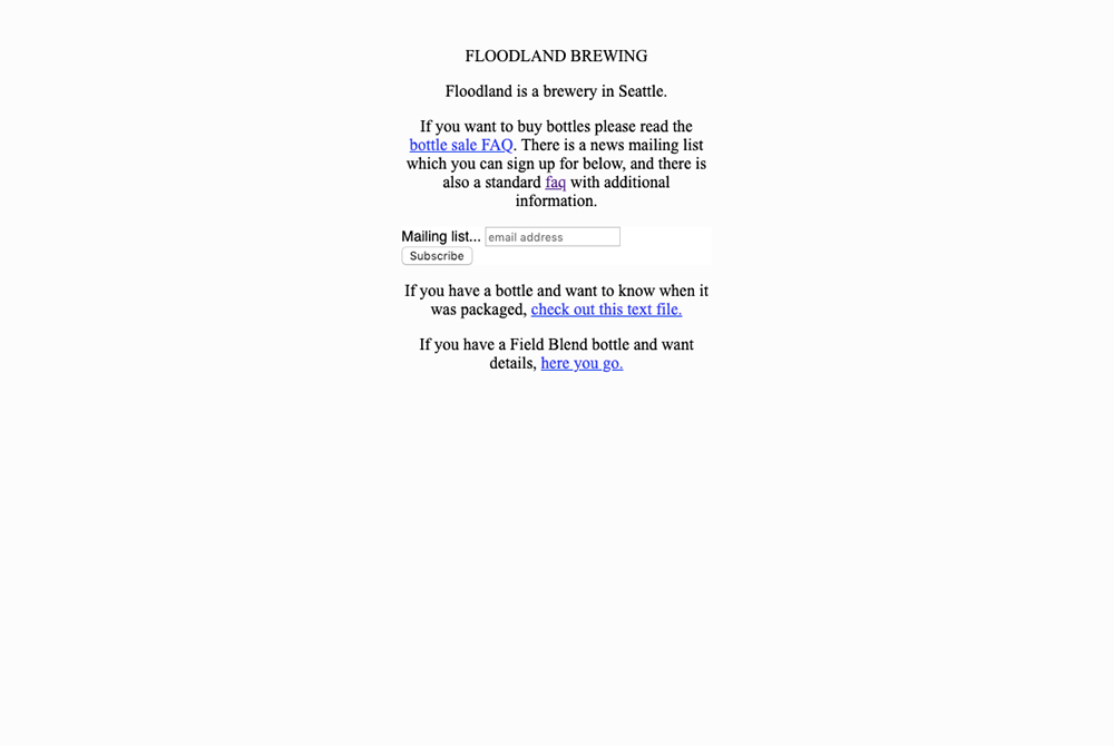
It’s a glorified .txt page. Hell, it’s not even glorified. It’s just a .txt page. But that’s why it’s so fantastic. If someone talks to you about Floodland, once they’re done raving about how glorious their beer is, they’ll mention the website. Its simplicity and preference for pertinent info rather than showiness speaks to the brewery ethos.
Founder Adam Paysse gets down to business. At floodlandbrewing.com you’ll find everything you need and nothing you don’t.
Now, you could argue the site isn’t thoughtful and doesn’t contain any elements of good design. But, it’s the minimal approach and emphasis on personality which makes the website feel unique and authentic to the brewery.
Archetype Brewing
Asheville, NC
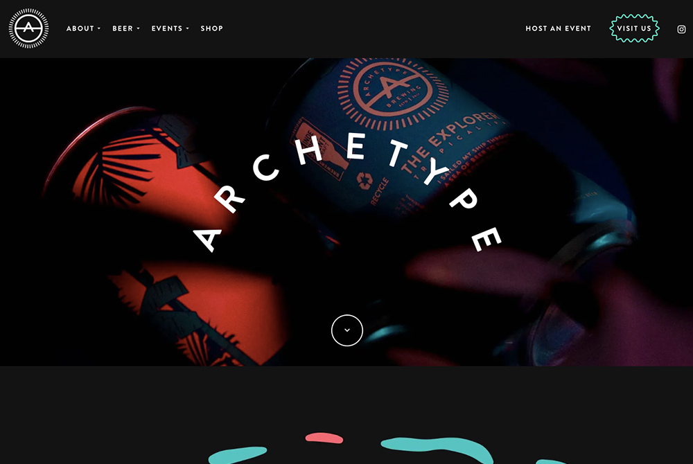
It should come as no surprise, but we often find that breweries with artful design programs have well-structured websites. In the past, we’ve sung the praises of Archetype’s beautiful labels, and that colorful, pop art design follows through on their site.
Powered by CraftPeak, Archetype’s site is intuitive and professional while still having some whimsy and personality. Hidden on the “About Our Beer” page is even a little personality quiz to assign you an “archetype” and match you with a beer. It’s a small element that demonstrates the Asheville brewery’s attention to detail.
Reuben’s Brews
Seattle, WA
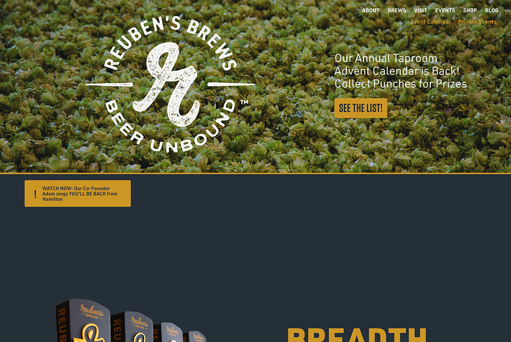
The website for Seattle, WA’s Reuben’s Brews is simple and efficient. It favors practicality and clean design over complex images and text. The photos of the taps, cans, and glass overlaid neatly on the homepage are stark and striking.
Top Hat, who also designed Hop Culture’s website, paired down the Reuben’s Brews site with the brewery’s base colors, a legible font, and easy navigation. It’s not showy or flashy but it’s substantive and effective. Much like Reuben’s Brews’ beers.
Two Chefs Brewing
Amsterdam, Netherlands
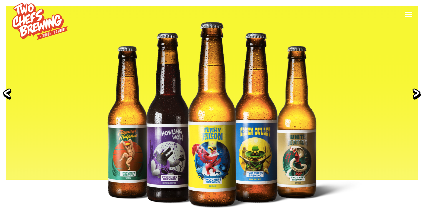
One of Amsterdam’s best breweries also happens to have one of our favorite websites. The homepage greets you with the brewery’s core bottles, which spin as you mouse over them. They also stop immediately mid-spin once you leave each bottle, which is a really excellent touch.
As a whole, the website is skillfully built, with engaging animations throughout. It’s dynamic and fun with useful information readily available. With so much going on, it may seem overwhelming, but taken together the design elements create a website with a life of its own.
Homage Brewing
Pomona, CA
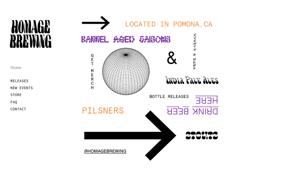
Similar to Floodland’s site, Homage favors a simplistic approach. And as is clear with the brewery’s can and bottle labels, there’s an art in simplicity. Founders Matt and Lauren Garcia are passionate about aesthetics and typography, in particular. And that shows in their merch and throughout their website. The critical information is tastefully curated and you can find elaborate photography on their Instagram.
Pang Pang
Hökarängen, Sweden
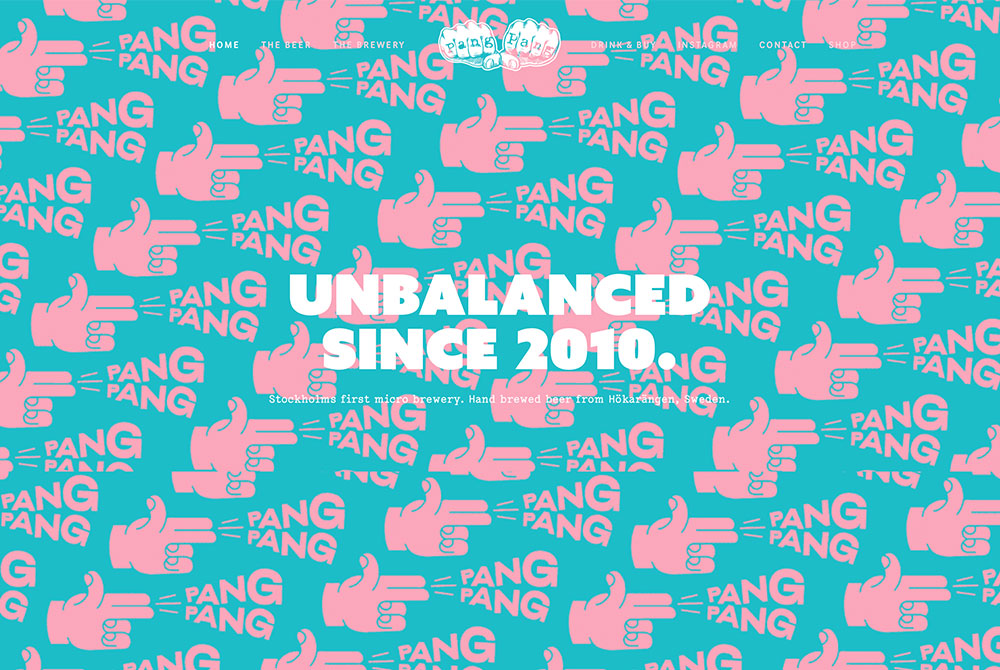
Hökarängen, Sweden’s Pang Pang craft brewery lets their beer do the talking. While some websites on this list offer technical wizardry, Pang Pang invested in bright, engaging colors and evocative photos of their beer. The website features extensive info about all of their offerings. And all of the important details are present and easy to find. But it’s the fluid and gorgeous art direction that earned this small but mighty brewery a spot on this list.
Little Blind
Brooklyn, NY
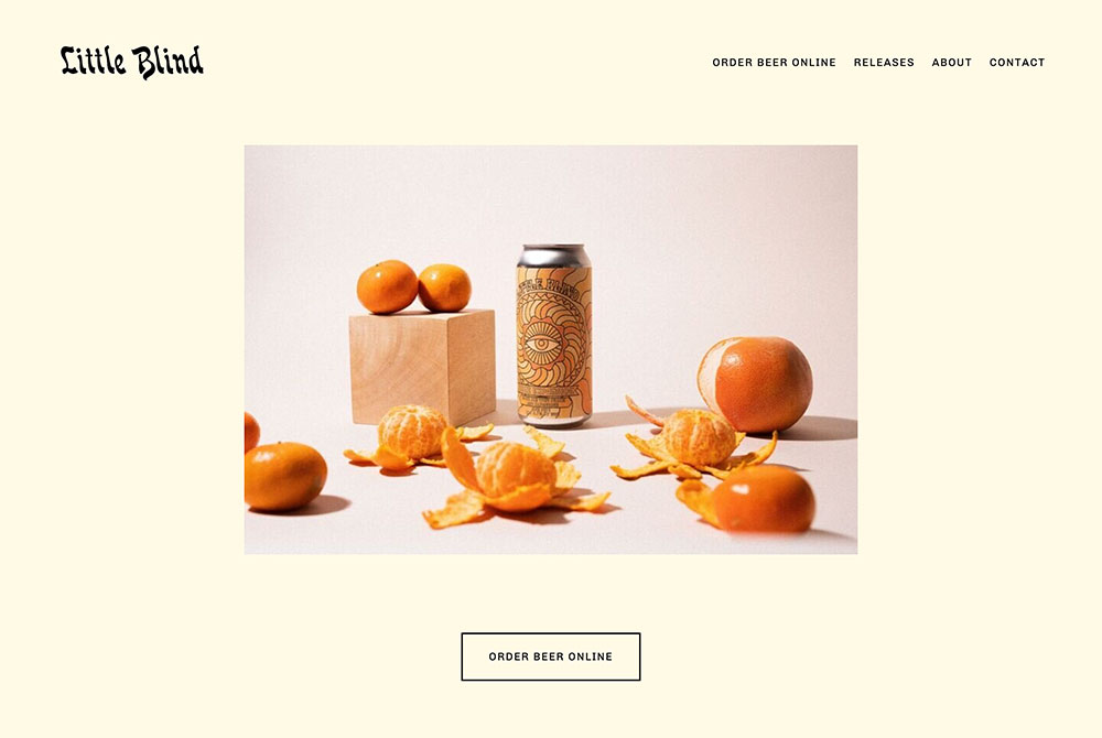
Little Blind is one of NYC’s newest craft breweries. A small, nomadic brewing project from Drew Bombard, who previously worked at Brooklyn Brewery and New Belgium, Little Blind delivers progressive, fine-tuned, modern beers in exceptionally designed cans.
With each can label, there’s a sense of age and preservation, like a well-worn record or zine. But, the product is fresh and innovative. So, it makes sense that Little Blind’s website greets you with warm colors and playful fonts. More importantly, the website is easy to navigate and makes clear the ethos and energy of Little Blind.
Hopewell Brewing
Chicago, IL
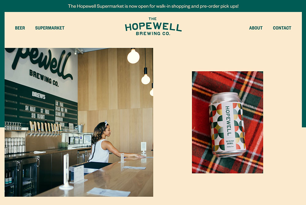
Another brewery that embraces the playful side of beer, Hopewell has quietly led the charge in the Midwest for historically-minded, yet elegantly contemporary design in craft beer. That comes through both in their packaging and in their incredible merchandise–especially their line of “nopewell” designed by Blank Studio. Hopewell’s website is a great introduction to the brewery and offers both clear information and a sense of joy.
CRAK Brewery
Padua, Italy
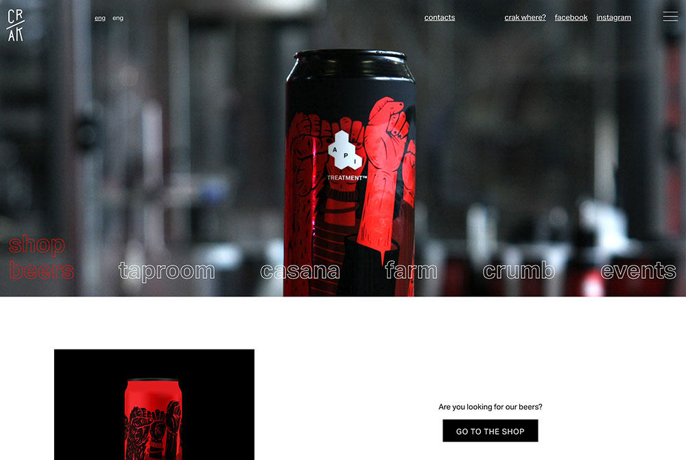
CRAK is without a doubt one of the most exciting craft breweries in Italy. Their team has translated the murky hazy IPAs of New England to the Italian countryside with engaging can designs and a balanced product.
On the website, you’ll find accessible information (in both English and Italian), high-quality photography, and a sense of personality, which combines new-school hype sensibilities (don’t miss that Supreme-style scroll of “freshcrak”) with rustic charm.
Halfway Crooks
Atlanta, GA
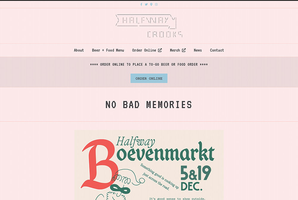
If you know me, you know I’m a sucker for just about anything designed by Office of Brothers. And their design instincts, along with the amazing technical and visual skills of Justin at Sixteenbit, fit perfectly with the blend of Belgian sheep farm and retro-tech nostalgia on display at Halfway Crooks.
Halfway Crooks not only produces some of the best low-ABV lagers around, but they also have a keen eye for visual language. Their physical taproom conveys everything they’re about. And their website is similarly effective. With .txt file font, esoteric descriptions, and humor, the digital Halfway Crooks experience is nearly as good as the physical one. Just with more 1s and 0s and less beer. Plus, there’s a hidden easter egg on the site for any eagle-eyed viewers!
Butcher’s Tears
Amsterdam, Netherlands
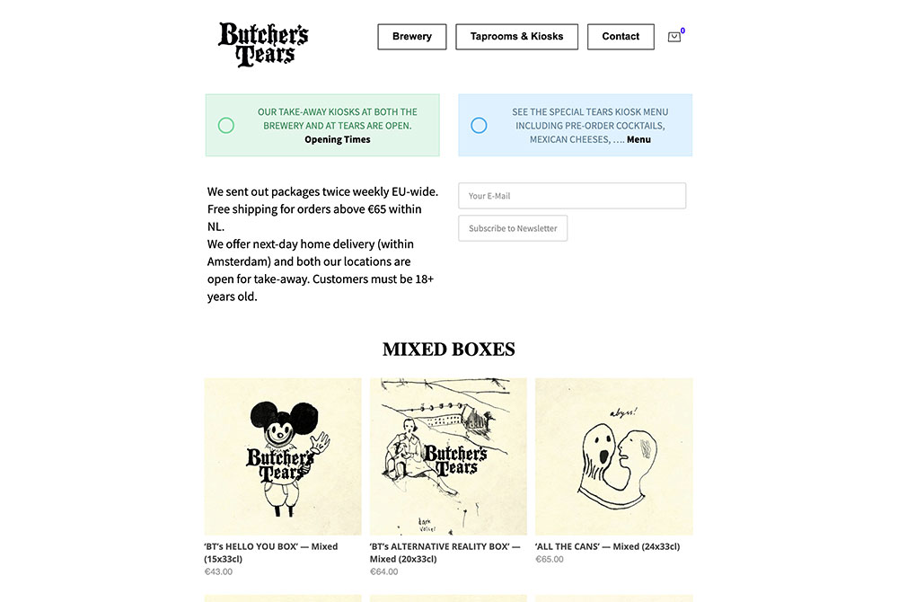
Butcher’s Tears is a true hidden gem brewery in Amsterdam. Typically not the first brewery you’ll find in a travel guide, there’s a sense of discovering a secret when interacting with Butcher’s Tears. In fact, my first trip to the brewery entailed a relatively long bike ride out of the city center, down a dead-end street, and into a white-tiled former butchery that now houses the brewery.
Butcher’s Tears’ art direction is both charming and haunting. Their labels could be on metal album covers or in vintage folk storybooks. And their website helps guide you through that experience, demonstrating their art style and providing you with all the information you need.
Take a trip to Butcher’s Tears. You won’t be disappointed.
Threes Brewing
Brooklyn, NY
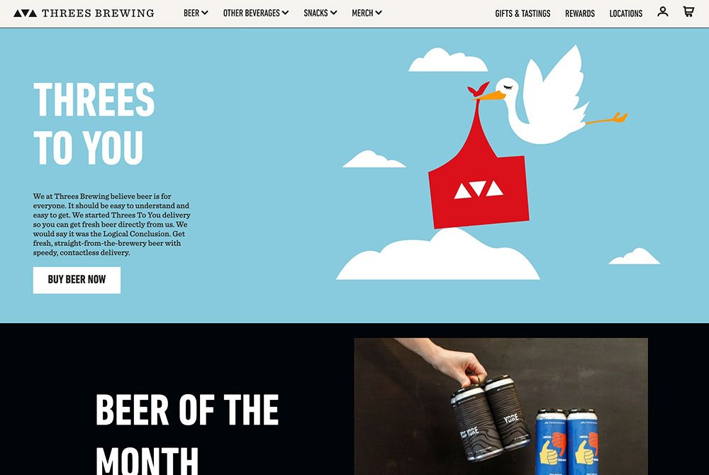
Threes was one of the many breweries that quickly changed business plans when the pandemic hit. Once one of Brooklyn’s truly special destinations, the taprooms shuttered; in place of physical venues came a digital space.
Almost overnight, Threes Brewing became a one-stop online shop for all your beer needs. Even before COVID, Threes had spectacular photography and helpful information on their website but now the brewery has turned their website into an online beer marketplace.
Although I’d do just about anything to get back to 333 Douglass Street, I can appreciate the amount of care and intention Threes has placed into curating its online space.
Dig Brew Co.
Birmingham, England
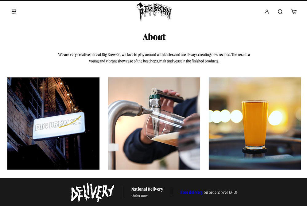
I’ll be honest, I wasn’t too familiar with this brewery before doing research for this article. But I was completely won over by the metal aesthetics and sense of humor. Across the board the brewery’s font choices are on-point. And the beautiful photography puts their amazing can labels front and center. The next time I’m in the U.K., I’ll be making a trip to Birmingham.
DSSOLVR
Asheville, NC
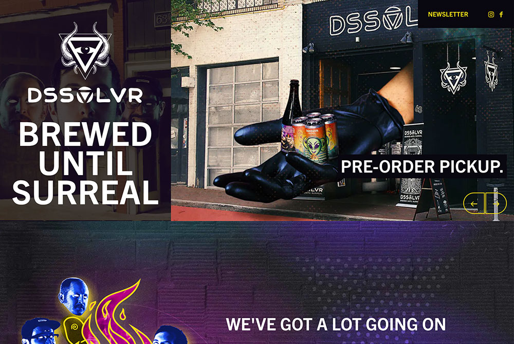
Enter the wild world of DSSOLVR, one of Asheville’s newest breweries. Designed by the website pros at Craftpeak, DSSOLVR’s site is a perfect distillation of the brewery’s penchant for surreal aesthetics. And the best part? The website feels professional and genuinely works. It’s just as easy to find important information as it is to get lost in the brewery’s trippy imagery.
Sierra Nevada Brewing Co.
Chico, CA
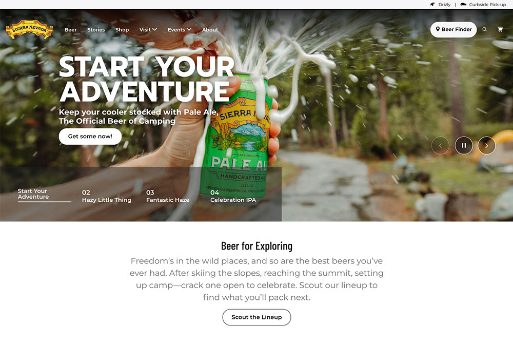
Who said old dogs can’t learn new tricks? Sierra Nevada has been around the block, but their website feels fresh and new. The website is a perfect representation of Sierra Nevada, one of the country’s largest craft breweries. Interacting with it is intuitive and the site feels professional without coming off as corporate or stuffy. And, leading with gorgeous adventure photography cements the brewery as one of the best options for the great outdoors.
The Ale Apothecary
Bend, OR
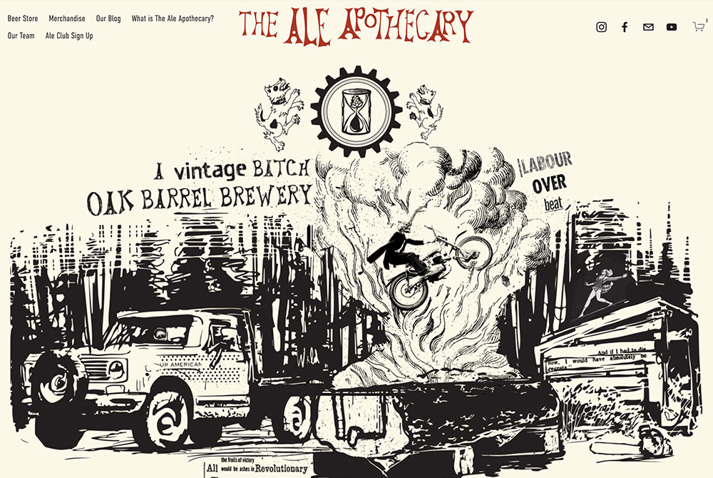
The Ale Apothecary is one of the few truly special breweries in the U.S. A couple years ago, our founder wrote about his pilgrimage to their tucked-away homestead/brewery and it remains one of my favorite pieces we’ve published.
Everything they craft is done so with care and thought. And that includes their website! Filled with lovely illustrations and honest expressions of their philosophy, The Ale Apothecary’s digital presence is just as endearing as their physical one. I strongly encourage you to watch the video on their homepage to get a better sense of why we love the Arneys so much.
Omnipollo
Stockholm, Sweden
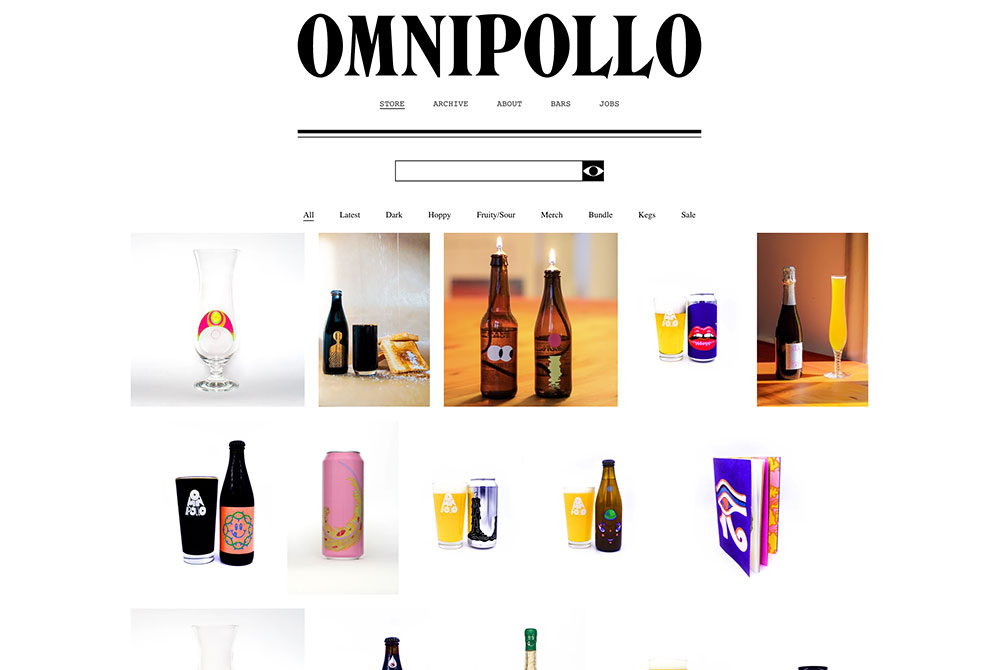
Surprisingly, the Swedish brewery known for its eye-catching label designs has a relatively understated website. But, the focus is still on the visuals. A first time visitor to the site is greeted by a moving kaleidascope before clicking through to a wall of Omnipollo products.
This striking grid not only features some of the fantastic Omnipollo beer available, but also some of their crazy merch offerings like a hard seltzer hand towel or a sterling silver ring. It’s a simple, but effective, look at the creative minds behind Omnipollo.
The Referend Bier Blendery
Pennington, NJ
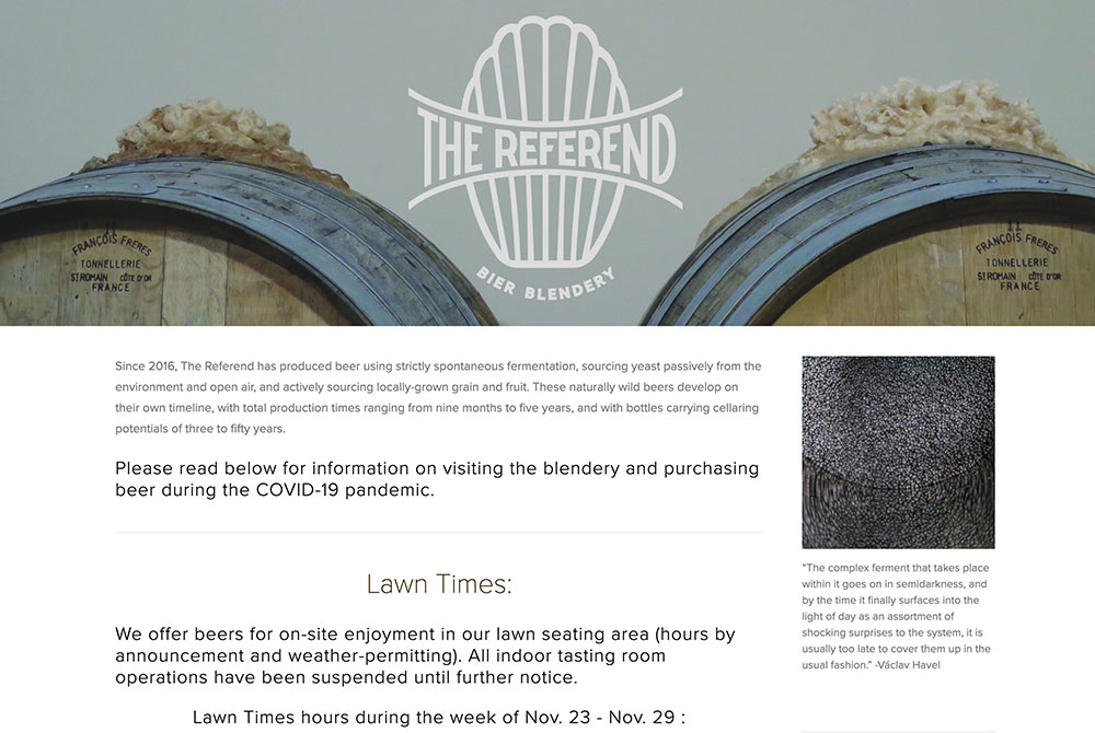
I’m pretty unabashed in my love of The Referend. It’s a genuinely special place run by genuinely incredible people. And their personality is perfect encapsulated in the brewery website. It’s a touch esoteric and maybe even chaotic but ultimately that’s the Referend experience.
Carefully placed quotes (“spontaneity: the great dream: paradise, power, delight,” Roland Barthes) abound on pages. The menu titles are slightly confusing at first but yes, of course “correspondence” has contact info and “materials” is the online shop. Ultimately, it just takes reading through the brewery’s “abstract” to understand just what The Referend is about. “(not basic.)”
Highland Park Brewery
Los Angeles, CA
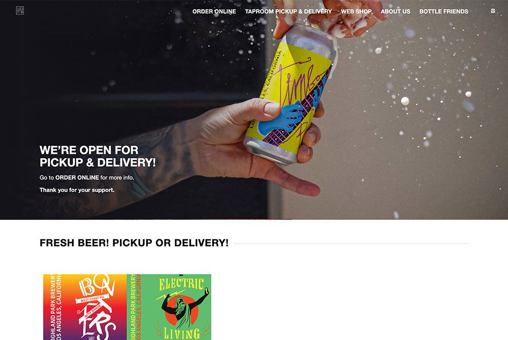
Every time I visit Highland Park’s website, I smile at the energetic opening of a can of Timbo Pils. Highland Park centers itself on its beer and backs it up with humor, wonderful artwork, and friendship. In the age of COVID-19, the brewery’s website is a bit more formal and practical with information about beer deliveries and pickups, but the fun still stays. It’s present in badass skull socks, show-stopping can designs, and one heck of a thoughtful website.
Forest & Main
Ambler, PA
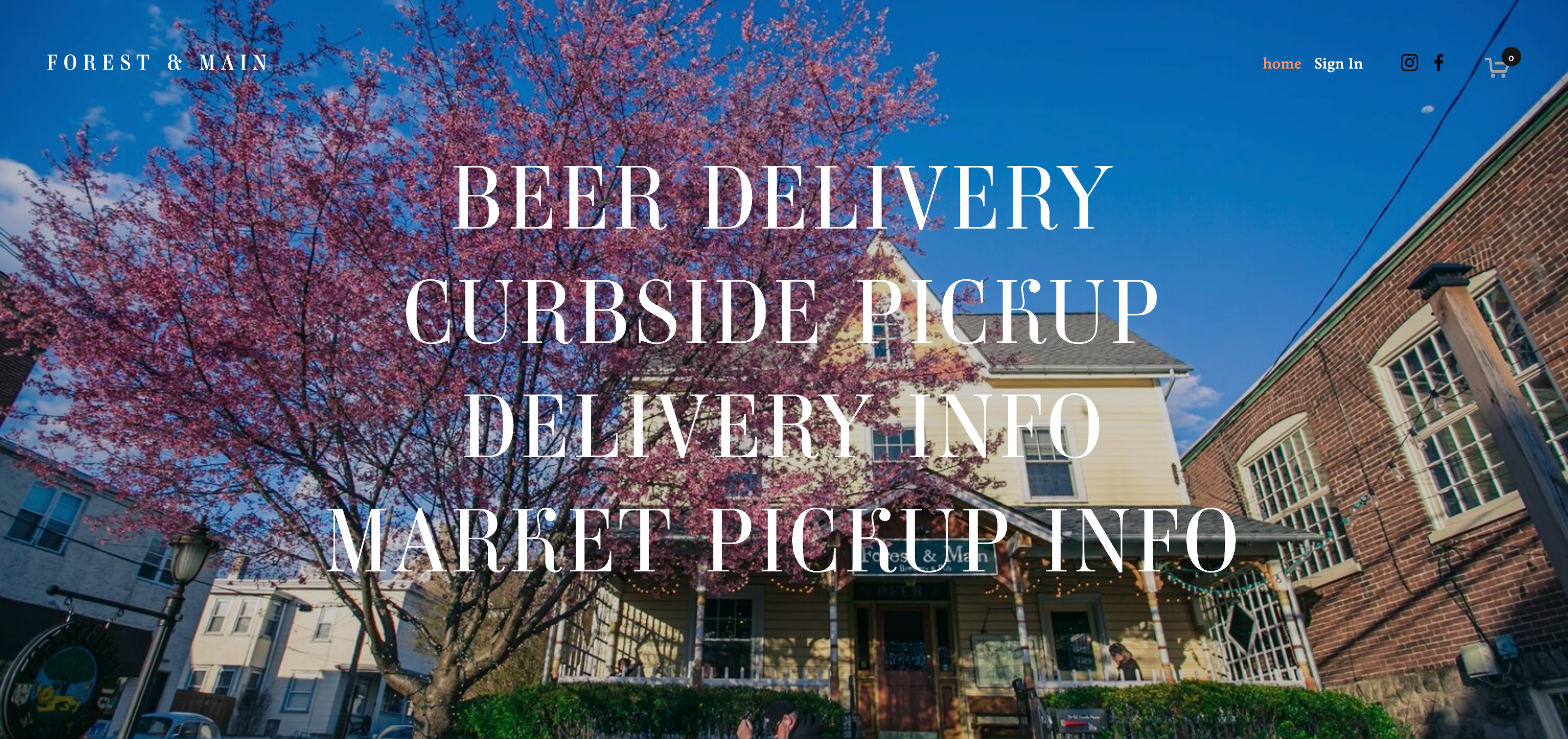
Like Highland Park, there isn’t any technical wizardry on Forest & Main’s website. But the simple sight of their cherry blossom tree is enough to make me want to visit the website. Moreover, I encourage you to seek out the beer descriptions because they might be the best brewery at describing their own beer. (“Notes of stoned holiday shopping, clementine syrup, frozen mango cubes, live resin AC/DC, and some wild pear soda.”)
The website is much like the brewery itself. Simple and exceptional.
Liked this article? Sign up for our newsletter to get the best craft beer writing on the web delivered straight to your inbox.

